Deutsche Bahn AG

Peak Spotting

A capacity planning tool that makes passenger load predictions visible and actionable for Deutsche Bahn's yield and operations managers — across the entire German rail network, 100 days ahead.

Peak Spotting
When I first saw the visualizations, it almost had me in tears. I was finally seeing what was happening.
— Capacity Manager, Deutsche Bahn

Challenge

Deutsche Bahn's yield and capacity managers had data — but only for individual trains, requiring a dedicated team to analyse each one. The full system picture didn't exist. Demand was growing at 5% a year, and at peak periods like Christmas 2016, teams were printing path-time diagrams and annotating them by hand just to spot overloaded lines. The underlying predictions came from neural nets and random forest models, but their outputs were completely illegible to the operational staff who needed to act on them.

Solution

Peak Spotting is a browser-based web application integrating millions of forecasted data points across Deutsche Bahn's long-distance network — combining custom visualisation tools (stacked histograms, path-time diagrams, corridor views, animated maps) with task management and collaboration features. Yield and capacity managers can spot bottlenecks, understand their scale, and act on them without leaving the tool. The application started as a rapid prototype to make predictions tangible early, then moved to Google's Material Design system with Studio Nand to build something that would last.

My Contribution

Moritz Stefaner led creative direction and data visualisation concept. I joined to own interface and interaction design — working within his direction to translate visualisation concepts into a usable, coherent tool. That meant information architecture, UI components, visual design, and the task assignment flow that made insights actionable. I also ran user research throughout: shadowing sessions and quarterly interviews with 5–10 people per round across different divisions. One finding: the animated map had little value for actual daily work, but was the tool that convinced new users the system was manageable. Knowing the difference mattered. Studio Nand handled production development.
  • Client

    Deutsche Bahn AG

  • My Role
    Interface Design
    Interaction Design
    Visual Design
    User Research
  • Time

    2017 – 2021

  • Collaboration

    Moritz Stefaner (creative direction, data visualisation), Stephan Thiel, Gabriel Credico, Lennart Hildebrandt (Studio Nand), Christian Au, Kevin Wang (Deutsche Bahn)

  • Awards

    Information is Beautiful Awards 2017 – Bronze, Deutsche Bahn Digital DNA 2021

Results

Information architecture
The application spans four panels in a single view — from a 100-day calendar overview on the left, to a network map, to a filtered train list, to a full train detail on the right. The left-to-right journey mirrors the cognitive task: from big picture to specific action.
Path-time diagram
Path-time diagram
The application generates path-time diagrams automatically — the same type capacity managers had been drawing by hand before Peak Spotting existed. Familiar in form, now built from live predictions across all corridors simultaneously.
Corridors
Corridors
The corridor view shows passenger load across major routes as stacked horizontal bars across all hours of the day. Users can immediately see which line is most affected and at what time.
Map
Map
The map view makes the entire German rail network feel manageable at a glance. Less a daily work tool than a strategic image: it communicated the system's scope to new users and stakeholders more effectively than any presentation could.
Hourly view of the German rail network
Sixteen small multiples show the state of the network hour by hour across a selected day. Users can see at a glance when peak loads occur and which regions are affected — a view that required no training to read.
Train list and detail
The workhorse. After spotting a problem in the overview views, managers come here to select a specific train, read its load forecast stop by stop, and assign tasks — add a wagon, set an alert, validate a prognosis — directly to colleagues. These signals later fed into automated planning workflows at Deutsche Bahn.

Process

  • Starting from what they knew

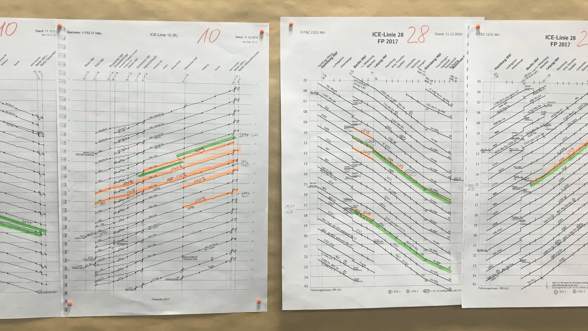
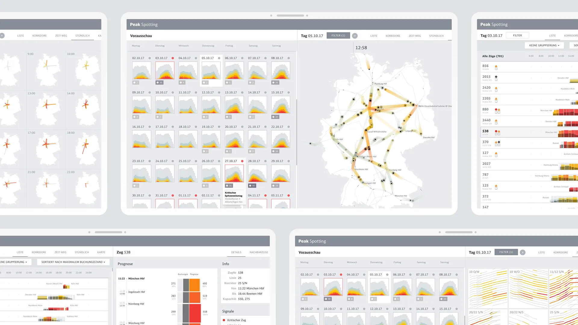
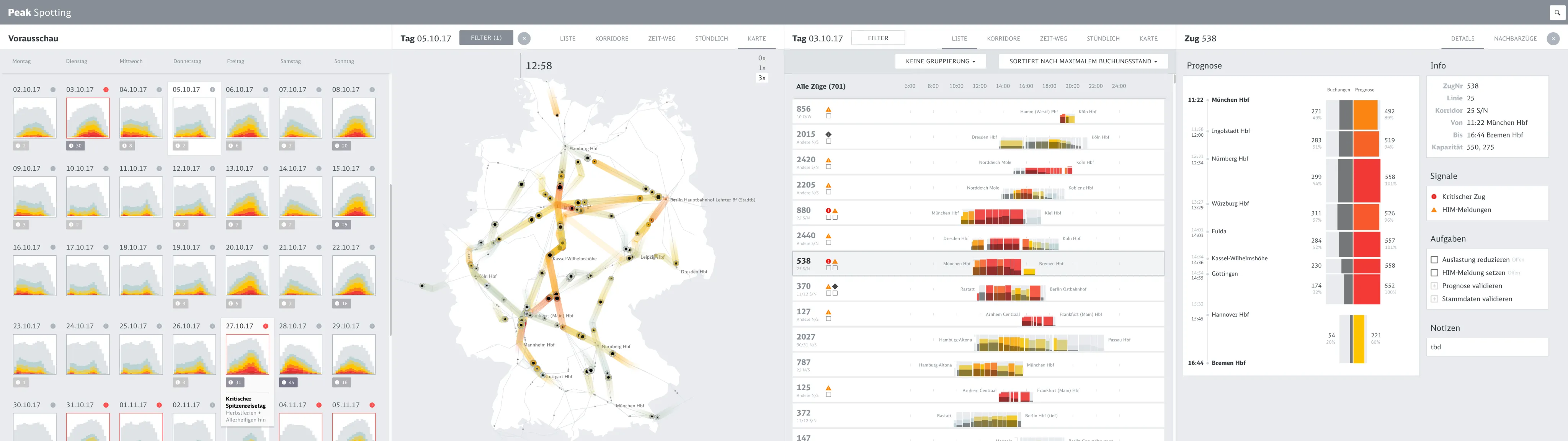
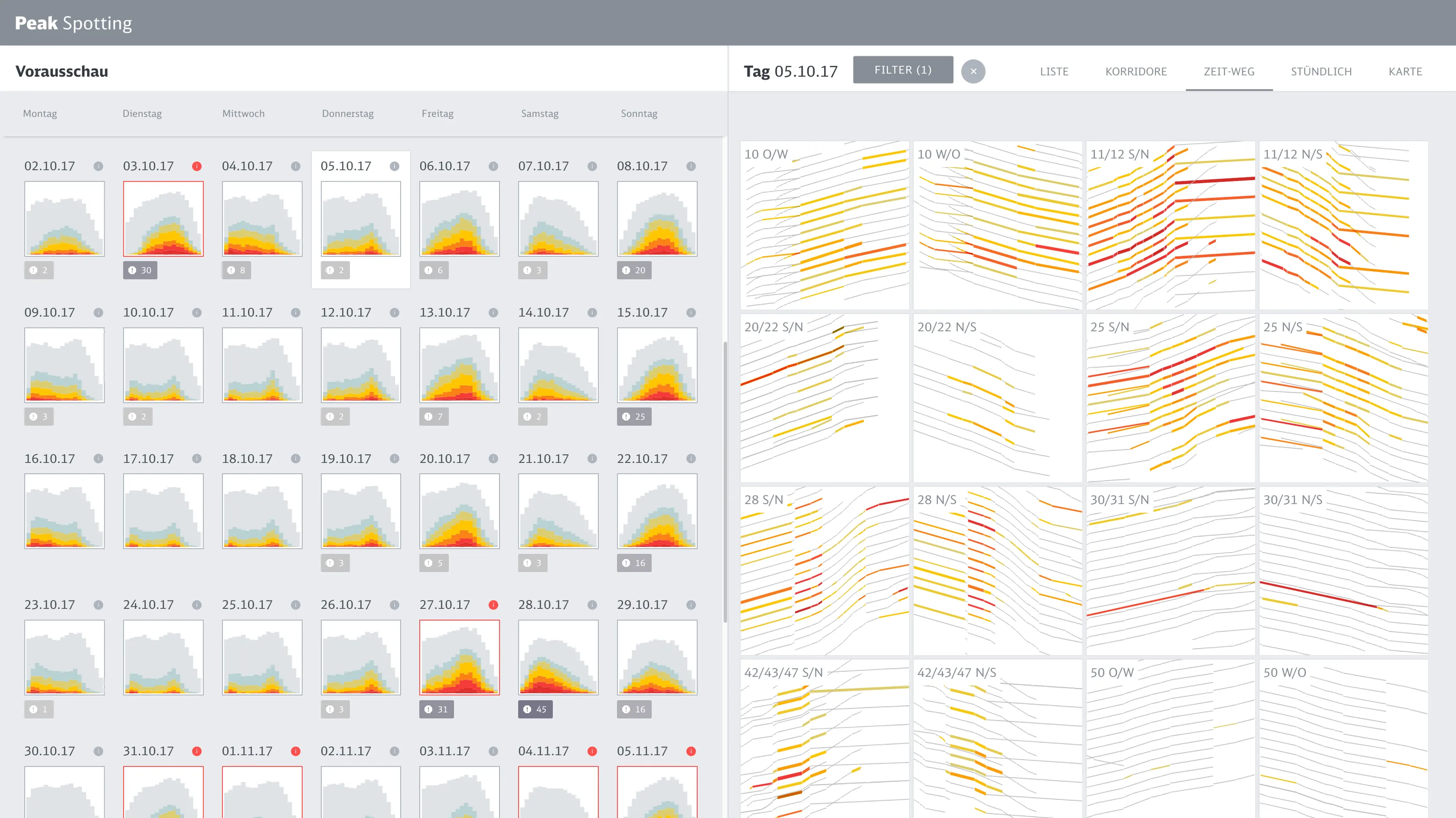
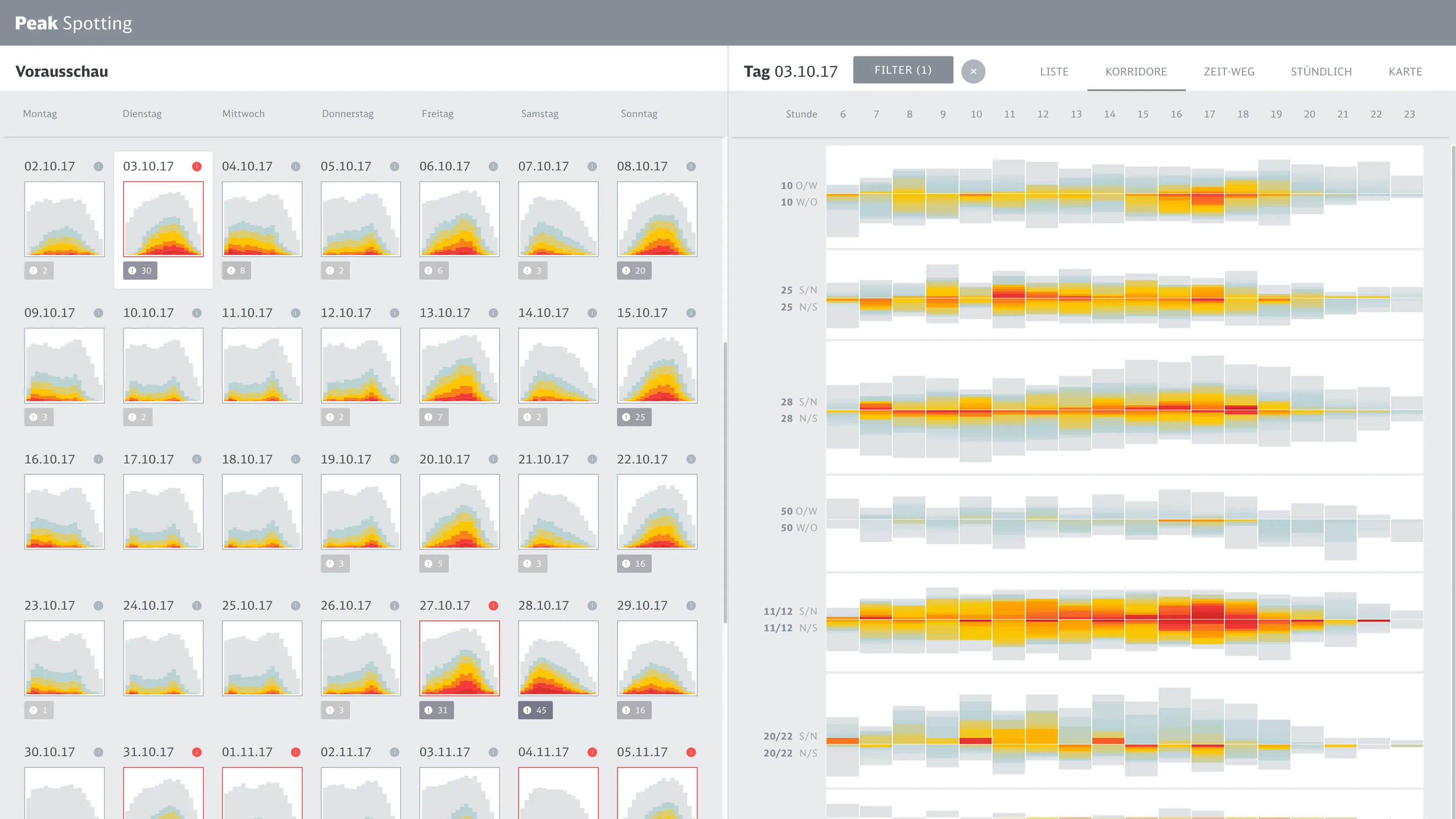
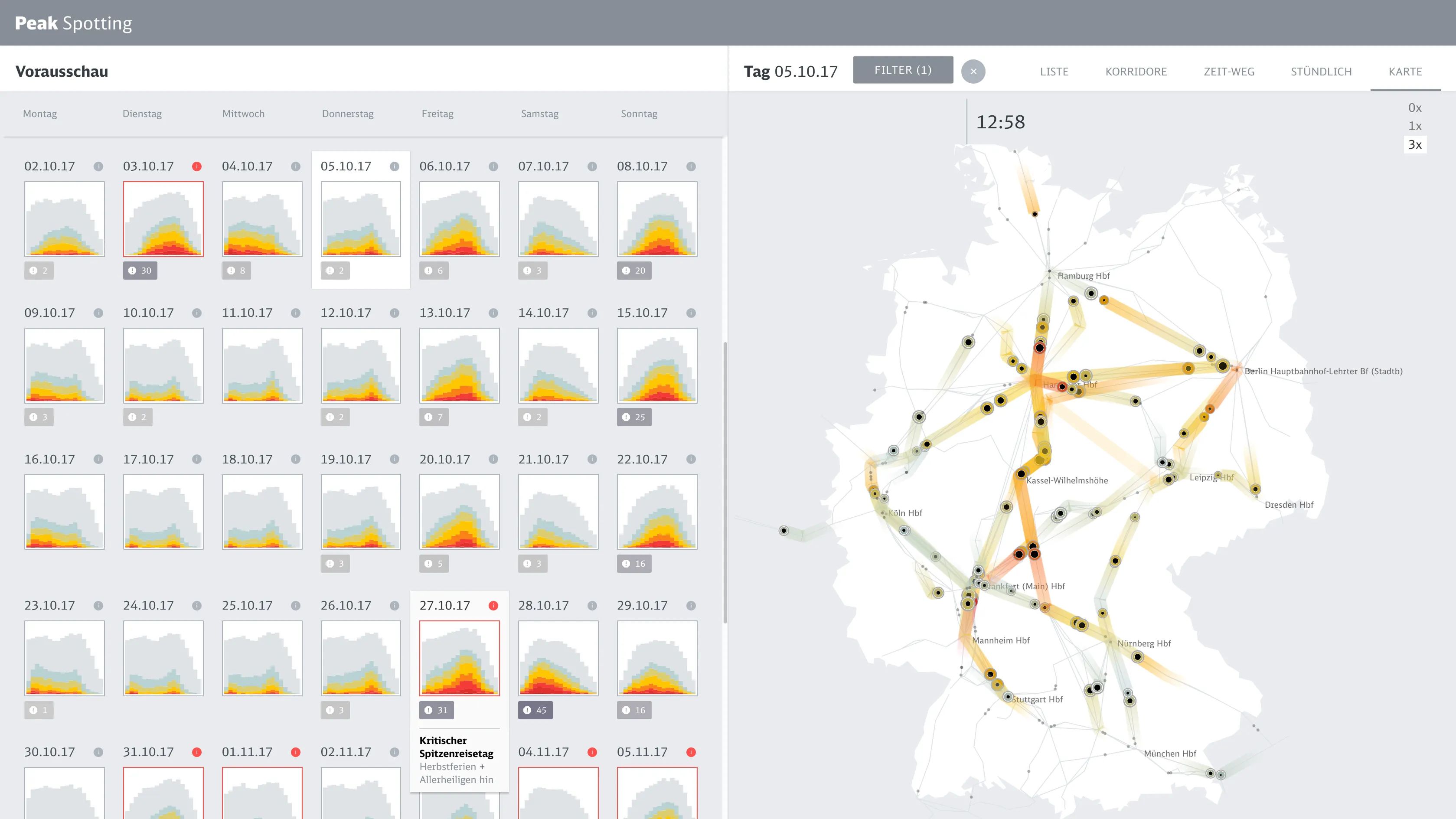
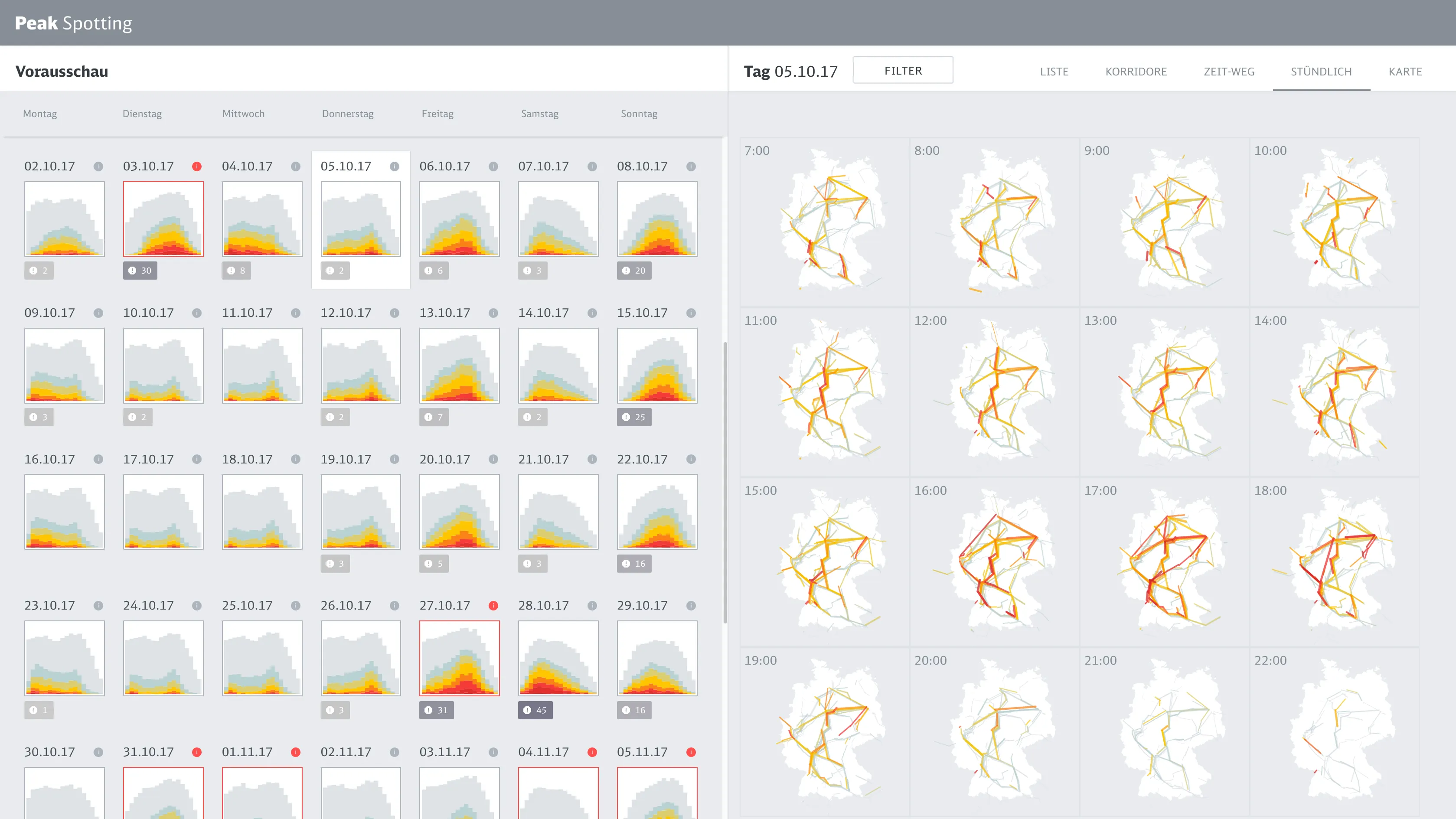
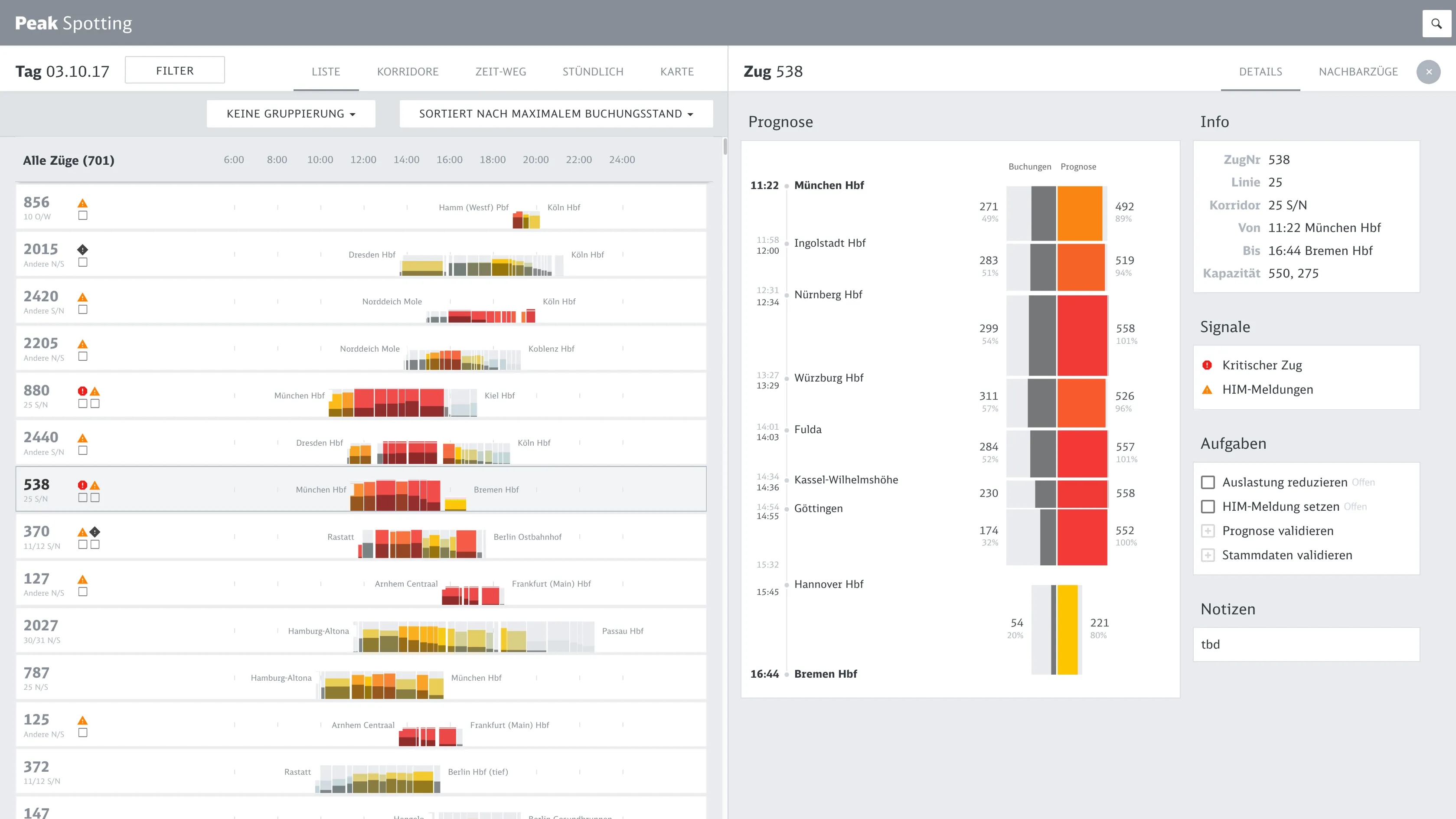
    The starting point was understanding how managers already worked. They showed us the hand-annotated path-time diagrams they printed at Christmas 2016 — their workaround for a system that couldn't show patterns. We took that familiar form as a design anchor: give them what they already understood, enriched with live predictions and interaction.

  • Prototype fast, then formalize

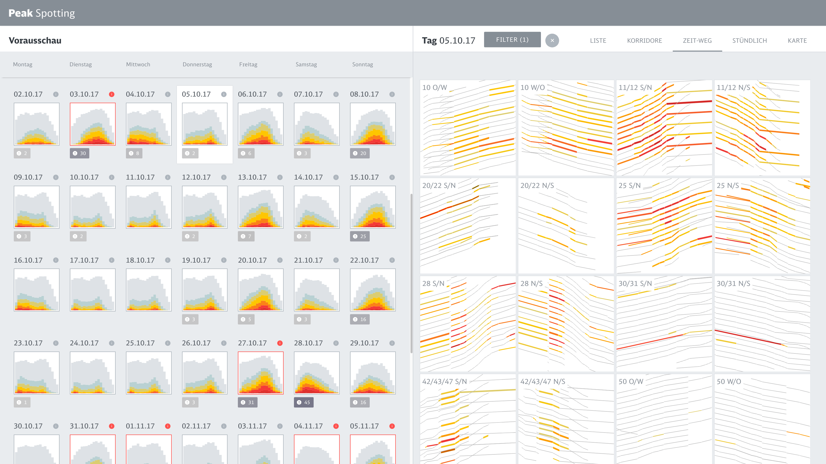
    We built a working data prototype quickly to make predictions tangible and get real feedback from users early. Once that proved the concept, we moved with Studio Nand to Google's Material Design system — a deliberate shift from speed to durability. Knowing when to switch was as important as moving fast in the first place.

  • Speedboats

    Alongside the main product, we ran short design sprints — focused explorations of new data views and interaction ideas, without the constraints of the full application. One sprint explored natural language search as a way to navigate trains. That became Spotti, a separate tool built for Deutsche Bahn's high-speed operations team.

    Impact

    Recognized as a trail-blazer

    Peak Spotting ran in continuous operational use at Deutsche Bahn for over four years — logging 1,681 users, 3,342 person hours, and 1.89 million UI events in year one alone. In 2021 it was recognized as part of Deutsche Bahn's Digital DNA, cited as one of the tools defining the organization's digital direction. It spawned a whole ecosystem of related services, including Spotti. Fast Company covered it as work affecting change in ways that are easy to measure, but also profound.

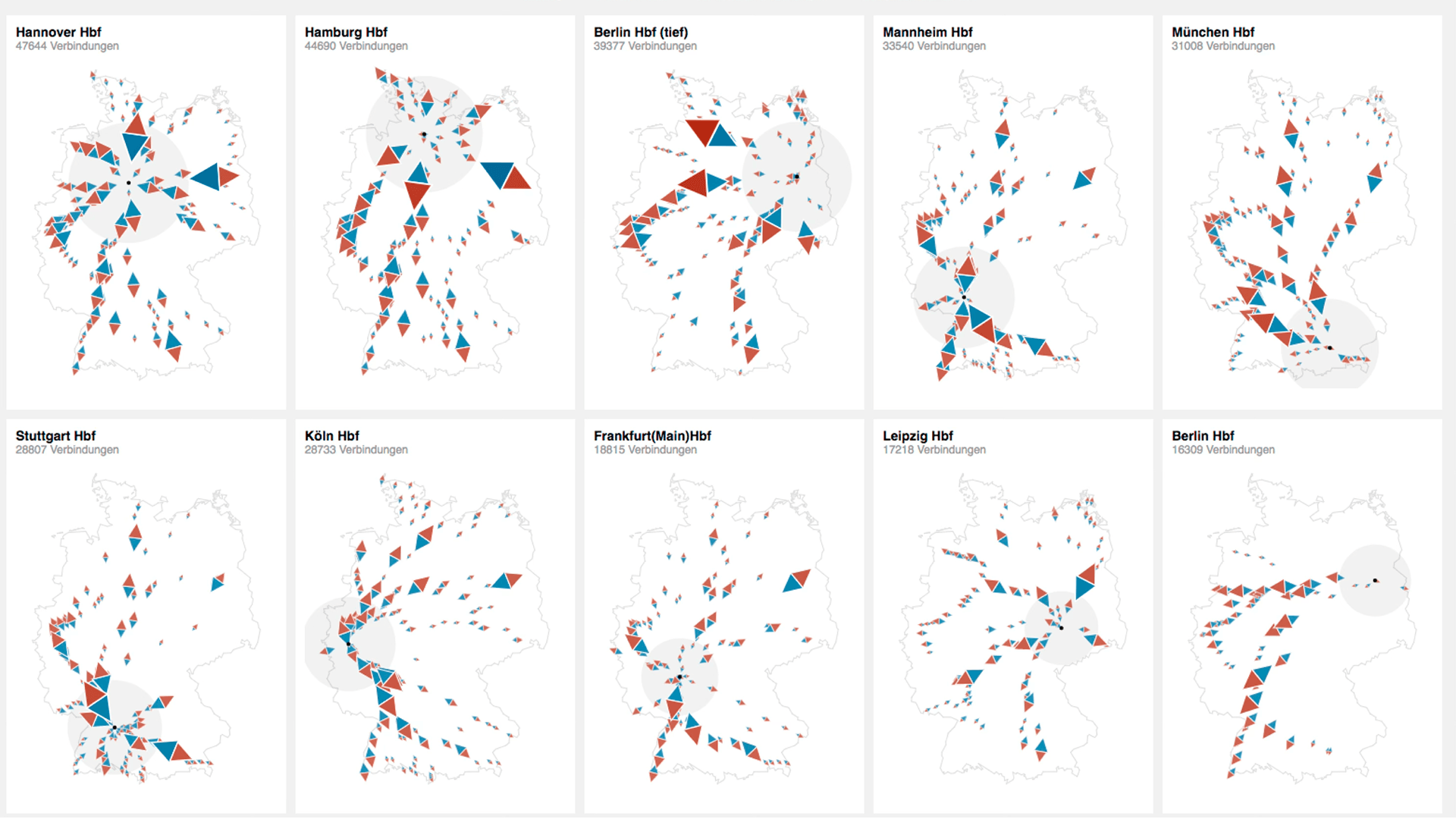
    Deutsche Bahn network in numbers

    2.93G
    Travelers per year
    8.0M
    Travelers per day
    33,401 km
    Rail network managed

    Learnings

    Seeing makes the difference

    The neural nets were predicting loads 100 days ahead — but that was only useful if the people acting on it could actually read the output. Designing that legibility, for non-expert users under time pressure, is what first led me to think about AI explainability as a design problem in its own right.

    Portrait of Christian Laesser

    Contact

    Do you need support for your next project?

    Time zone

    CET

    Current time

    Reply time

    2work days

    Your next project starts with a conversation. Not sure if your project is a good fit? Read the FAQ first — it might answer your question before we even talk.