State of the Fossil-Free Internet 2026
Five data visualizations for the Green Web Foundation's first annual briefing on dirty data centres, AI energy demand, and the race to clean up the internet.
Challenge
Solution
My Contribution
- Client
Green Web Foundation
- My RoleData Visualisation
- Time
2025–2026
- Collaboration
Katrin Fritsch (project management), Solana Larsen (lead editor), Audrey Hingle (communications), Alice Apsey (visual identity, report layout, PDF), Nick Lewis (web development)
Results
Static Assets

Process
-
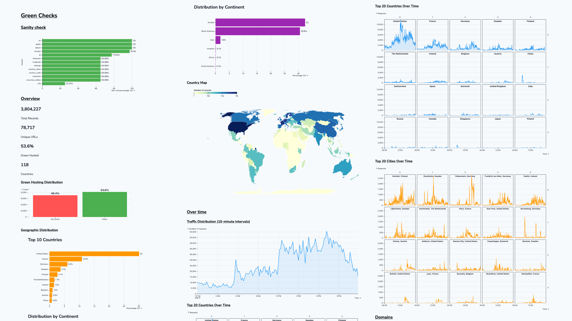
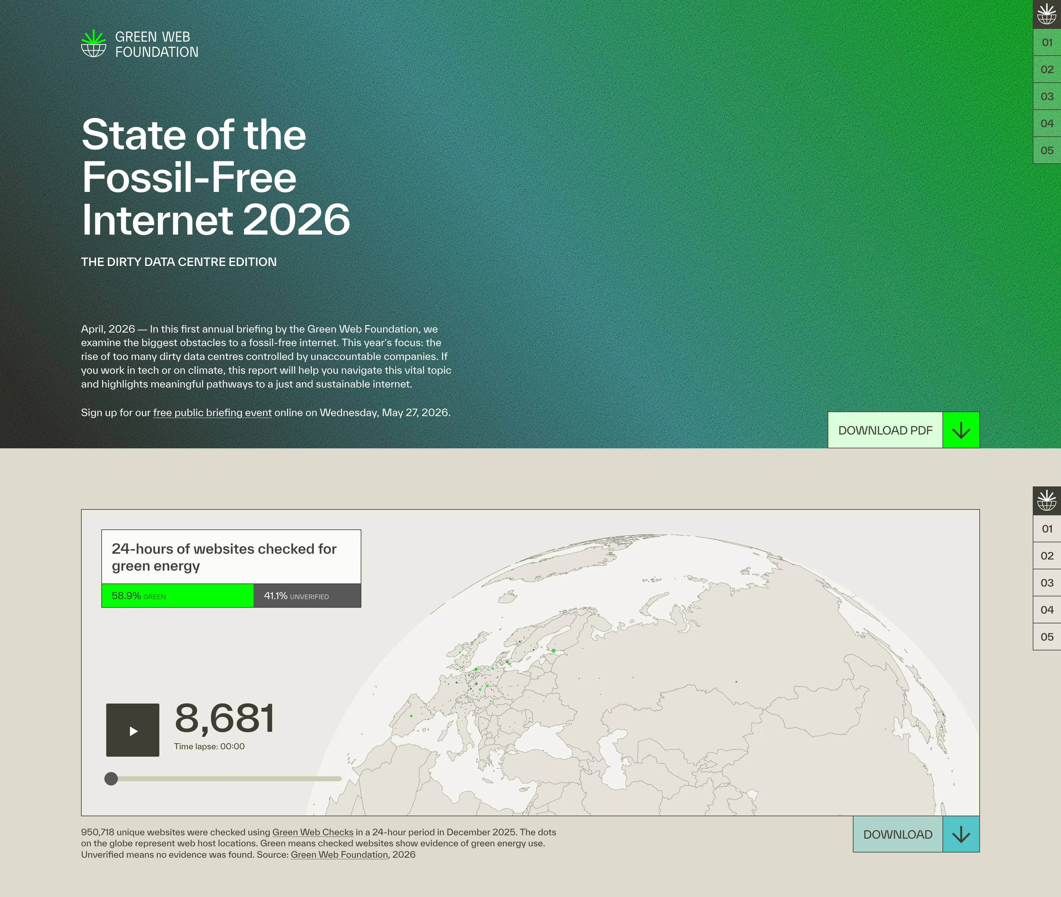
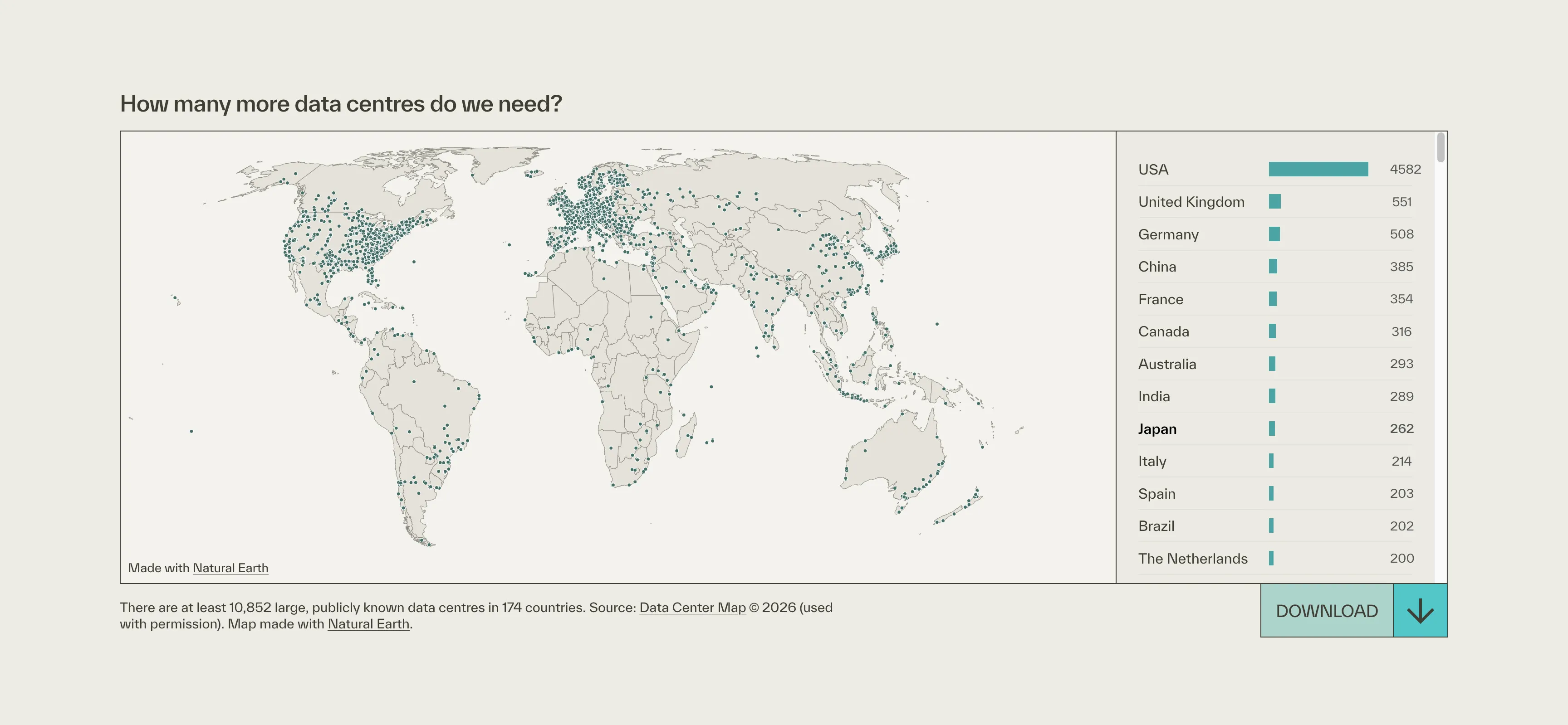
The process started not with design but with data. Working in Observable Plot.js, I mapped the Green Web Check dataset from multiple angles, including distributions by geography, traffic patterns over 24 hours, country and city breakdowns. That exploration was a shared working process with the team: it surfaced which findings were actually surprising and which were less interesting than expected. The final set of five visualizations is a direct result of that phase. Without it, we would have been designing against assumptions.
-
Once the data exploration defined what to build, the work moved to Figma for mockups and then directly to production code. Each visualization had two targets from the start: an interactive embed for the web report and a downloadable PNG for press and slide use. That dual-output requirement shaped every design decision, from labelling and annotation density to download affordance, and was resolved before a single line of production code was written.
-
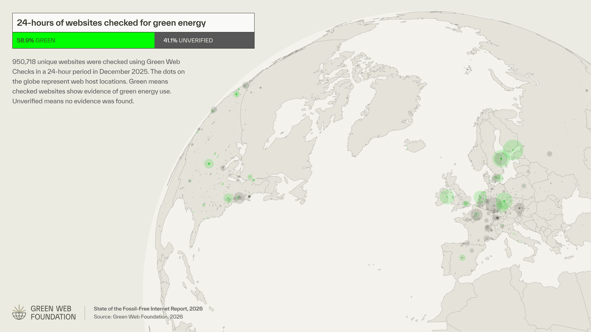
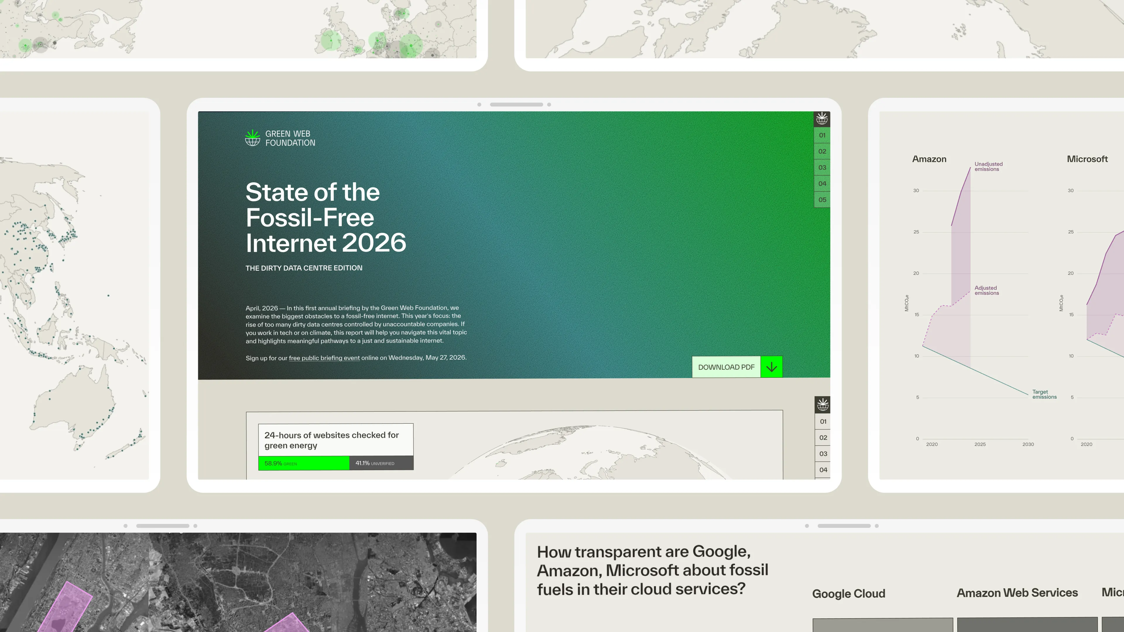
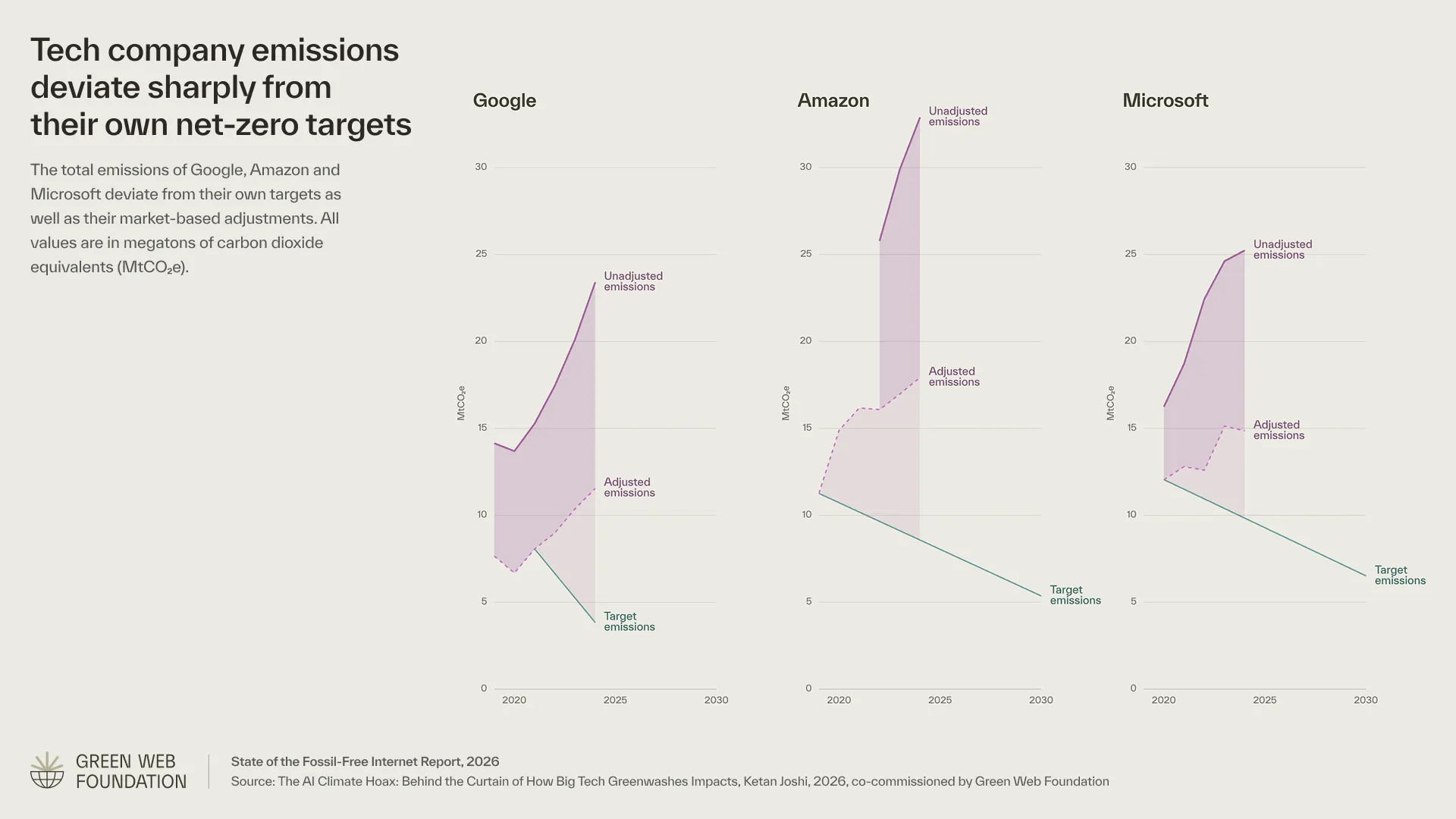
The downloadable press asset for the Green Web Check globe is the same visualization as it ships to media, with report branding, the 58.9% / 41.1% legend, and the source line intact. Every chart had a version like this: self-contained, ready to drop into a slide deck or press kit without further editing.
Impact
Strong community response
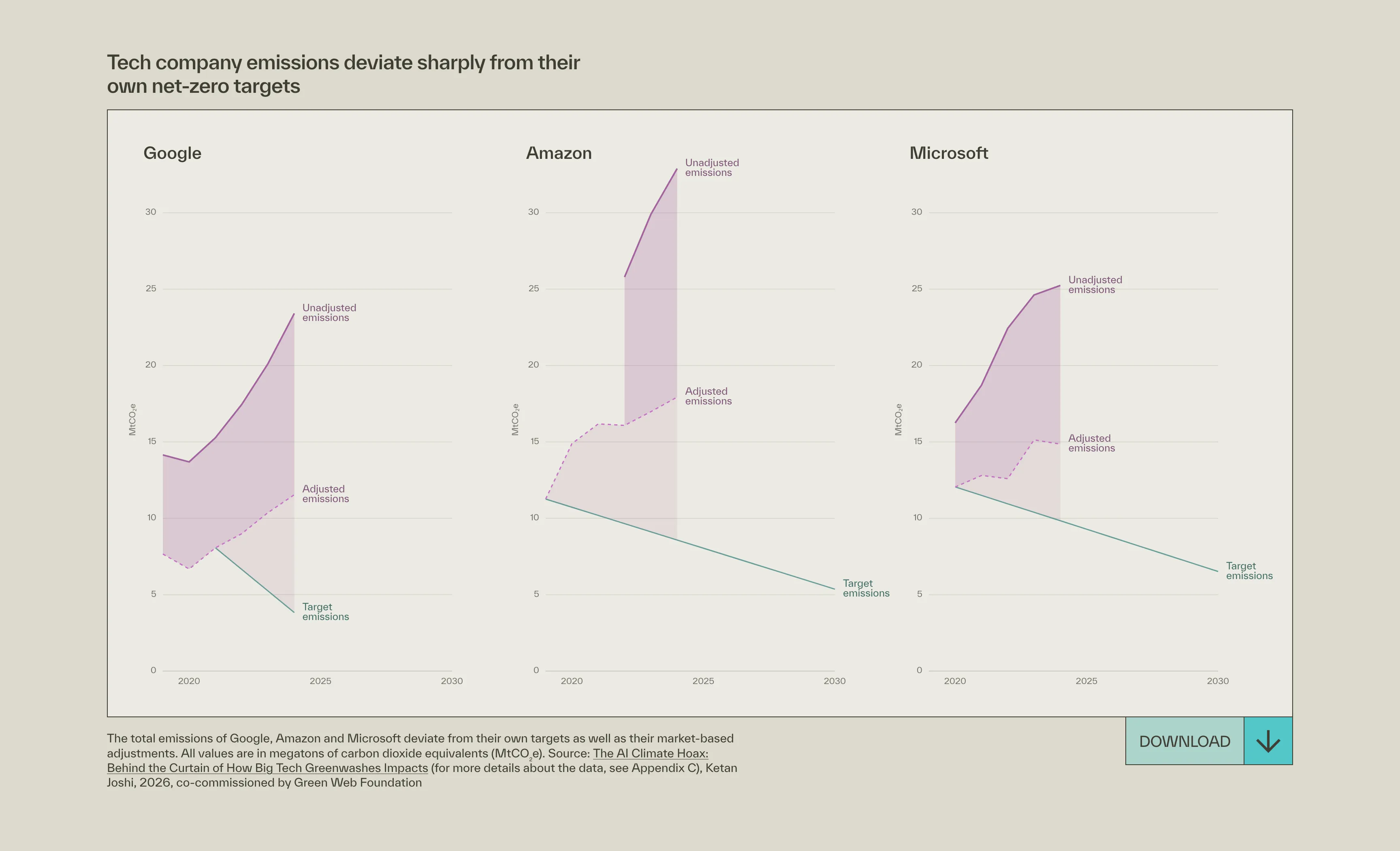
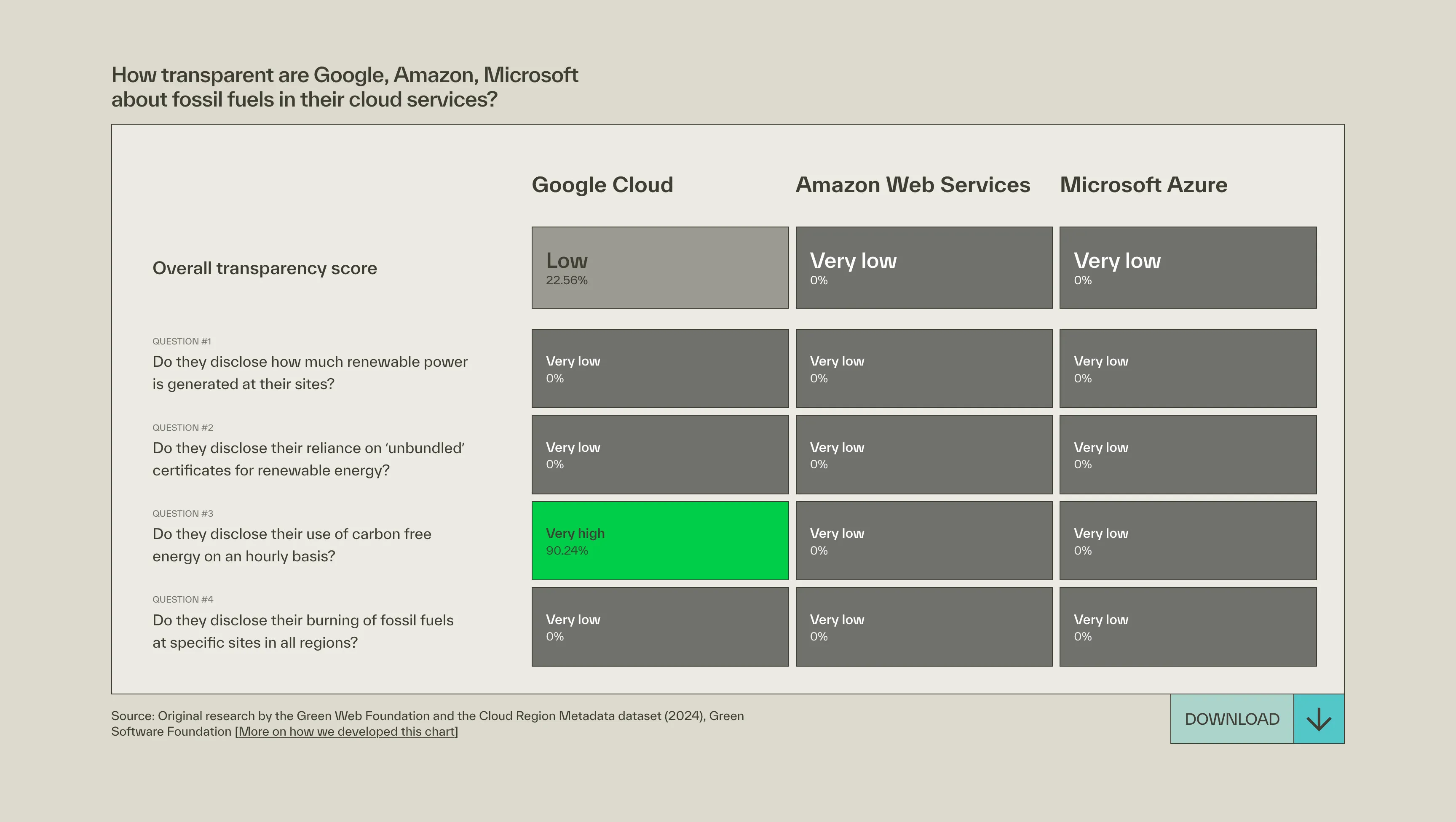
The report launched to immediate response across the sustainability and tech communities. Climate writer and analyst Ketan Joshi — whose own research on tech company emissions informed the deviation charts — called out the transparency scorecard specifically: 'It isn't easy to depict the meaningful significance a blank space but I think the team did a great job.' Andy Davies of Wholegrain Digital named the visualization work directly: 'The work that Nick, Alice and Christian have put into the site is inspiring.' The Green Web Foundation's own launch post reached 117 reactions and 40 reposts within the first four weeks. The report was covered editorially by The Energy Mix, shared by researchers including Dr. Sasha Luccioni (Chief Scientific Officer, Sustainable AI Group), and cited across sustainability and digital infrastructure networks.
Report reach in the first 4 weeks
Learnings
Using AI to build a report about AI
This project was one of the first where I used Claude Code throughout, for data processing, chart iteration, and writing production code for the WordPress embeds. On a fixed budget, that made the difference between delivering five interactive visualizations and delivering three. There's a real tension in that, given the subject matter: the report documents the environmental cost of AI infrastructure at scale. The distinction I'd draw is between hyperscale compute (training runs, always-on GPU inference) and a coding assistant helping write lighter, more efficient client-side JavaScript. One is the problem the report is about. The other is a tool for building more efficiently within tight constraints. The report argues for reducing demand and building responsibly. That's what I tried to do.

Contact
Do you need support for your next project?
Time zone
Current time
Reply time
Your next project starts with a conversation. Not sure if your project is a good fit? Read the FAQ first, it might answer your question before we even talk.