German Federal Foreign Office

Climate—Conflict—Vulnerability Index

An interactive index mapping the overlap between climate and conflict risk — built for policymakers and researchers at the German Federal Foreign Office and its partners.

Climate—Conflict—Vulnerability Index
The best early warning system for our own security.
— Annalena Baerbock, Former Federal Foreign Minister, Berlin Climate Security Conference 2024

Challenge

Policymakers at the German Foreign Office and partner institutions needed to assess where climate and conflict risks overlap globally — but no single, regularly updated, scientifically grounded tool existed to make that overlap visible in one place. Existing tools covered climate or conflict in isolation, rarely both, and often lacked the transparency required for policy-relevant decision-making. The previous workflow was fragmented: an internal team producing custom maps on demand, with no ongoing comparative evidence base. The core design challenge was to make scientific rigour and usability coexist: a 42-indicator, three-pillar index had to be navigable by non-technical audiences without sacrificing the transparency that makes the data credible.

Solution

The project has two distinct outputs. The public tool at climate-conflict.org gives researchers, journalists, and civil society organizations a global risk overview map to explore where climate hazards, conflict exposure, and vulnerability overlap — down to a 0.5° grid. Beyond the map, the public site is designed for transparency: a full methodology section explains the index architecture and aggregation logic, an indicator catalogue documents all 42 indicators with source attribution and data recency, a time coverage overview shows exactly what periods each indicator covers, and the underlying data is freely downloadable. Alongside this, an advanced internal tool was built for the German Federal Foreign Office, enabling detailed country-level analysis for decision-making. Rather than one-off visualizations for either tool, a Data Design Language was developed: a design-token-based system giving the PREVIEW team a reusable repertoire of components, guidelines, and chart templates to apply independently across tools and contexts.

My Contribution

Brought in by Moritz Stefaner as UX/UI lead, I was responsible for the information architecture and screen design of the internal CCVI tool — across both the global overview and country profile views. I designed the individual data visualization widgets and charts: trend sparklines, KPI bars, the data explorer map-and-timeseries pairing, and the country ranking table, each iterated through user research with Foreign Office and GIZ staff. I integrated Moritz's data visualizations into the broader UI system, contributed to the public website (v2) and the Data Design Language, and helped build Observable HQ notebooks to teach the Foreign Office team to create their own visualizations from the design language we built together. Moritz held creative direction throughout; Flavio Gortana contributed map components and development.
  • Client

    German Federal Foreign Office

  • My Role
    UI/UX Design
    Data Visualization
    Science Communication
  • Time

    2023 – 2025

  • Collaboration

    Moritz Stefaner (Truth & Beauty, design lead and development), Flavio Gortana (design and development), Jan Johannes (development)

  • Awards

    Information is Beautiful Awards 2024 – Shortlisted

Results

Data Design Language
The data design language started as a set of PDF guidelines, but didn't end there. Style tokens followed for Figma, JavaScript, and CSS themes — giving the Foreign Office team a consistent visual foundation they could apply independently.
Data Design Language Documentation Website
To support the team at the German Foreign Office, we built an internal documentation website where staff could copy the style values and UI components they needed — lowering the barrier to consistent, on-brand data communication.
CCVI Tool — Overview
The internal tool gives Foreign Office staff a global overview of climate-conflict risk by country. Alongside the overall risk score, users can select individual metrics to explore a first-pass assessment across the full index hierarchy.
CCVI Tool — Overview — Annotated
The global overview screen annotated — five key functions visible to a Foreign Office analyst at a glance: the layered world map, a most-affected-countries shortlist, full metric hierarchy navigation, contextual layer information, and an export function. Everything a decision-maker needs without opening a second tool.
CCVI Tool — Country View
The country detail view shows key indicators for a selected country alongside trend sparklines that highlight which indicators are showing the strongest relative change — helping staff make a fast assessment and identify which areas warrant deeper investigation.
CCVI Tool — Country View — Annotated
The country detail view annotated — from side-by-side climate and conflict risk maps at top, through domain-specific widgets surfacing the past 90 days of conflict activity, to key indicator trends and a cross-country ranking table. Designed to support a rapid country assessment in a single scroll.
CCVI Tool — Widgets
CCVI Tool — Widgets
The widgets in action for Syria: conflict activity overview showing fatality counts and share of population exposed to violent conflict, actor and event detail cards, fatality change trends, and climate hazard exposure by affected population. Each widget surfaces a specific type of evidence quickly — not for deep analysis, but for fast country briefings.
Foreign Minister Annalena Baerbock presenting the CCVI
Federal Foreign Minister Annalena Baerbock presenting the CCVI at the Berlin Climate Security Conference 2024 — the tool's public launch moment, introducing it to an international audience of policymakers and researchers.
Public Website — Data Map
The public website offers a grid-based risk score map covering the entire world — making the index accessible to researchers, journalists, and civil society organizations beyond the Foreign Office's immediate network.
Methodology
Methodology
The public methodology page alongside the index architecture diagram — showing how the three pillars branch into dimensions and down to individual indicators. The visual makes the aggregation logic auditable: viewers can trace exactly how a country score is constructed, which matters when the data informs foreign policy decisions.
Indicator Catalog
Indicator Catalog
42 indicators, each with a plain-language description, raw unit, data recency, and source attribution — drawn from open data sources including NASA, the World Bank, and ACLED. Filterable by pillar, searchable by name. Transparency built into the interface, not just the documentation.

Process

  • Visualizing conflict detail

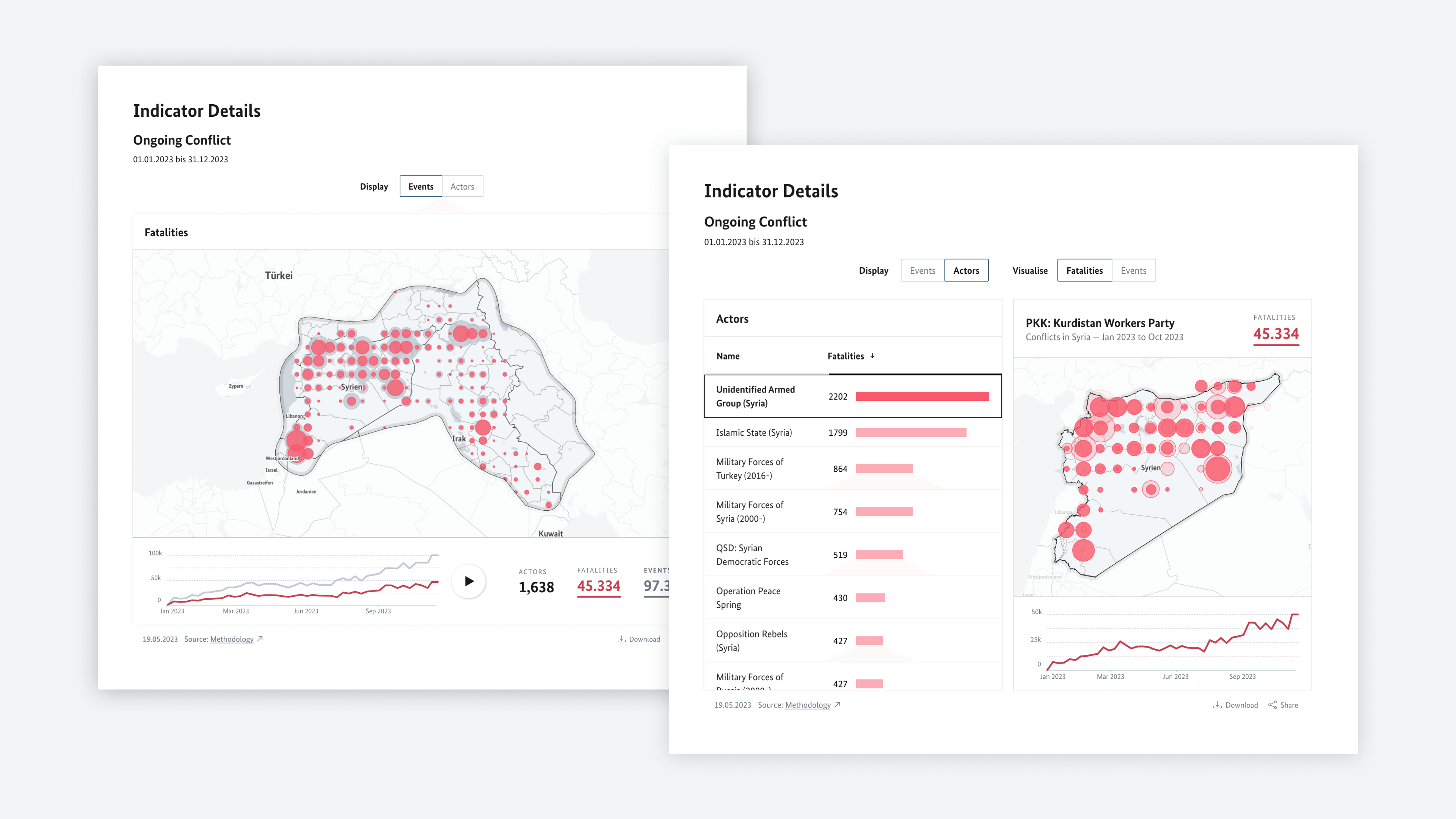
    In the early concept phase, we explored how the internal tool could let analysts deep-dive into conflict detail at the country level. The result was almost a tool within a tool — a fully navigable conflict explorer showing fatalities, events, and actors with map and timeseries views. It was a valuable exploration, but it showed us early on that this level of depth risked pulling the tool away from its purpose: fast, comparative assessment across many countries, not deep forensic analysis of one.

  • Idea: Data Lenses

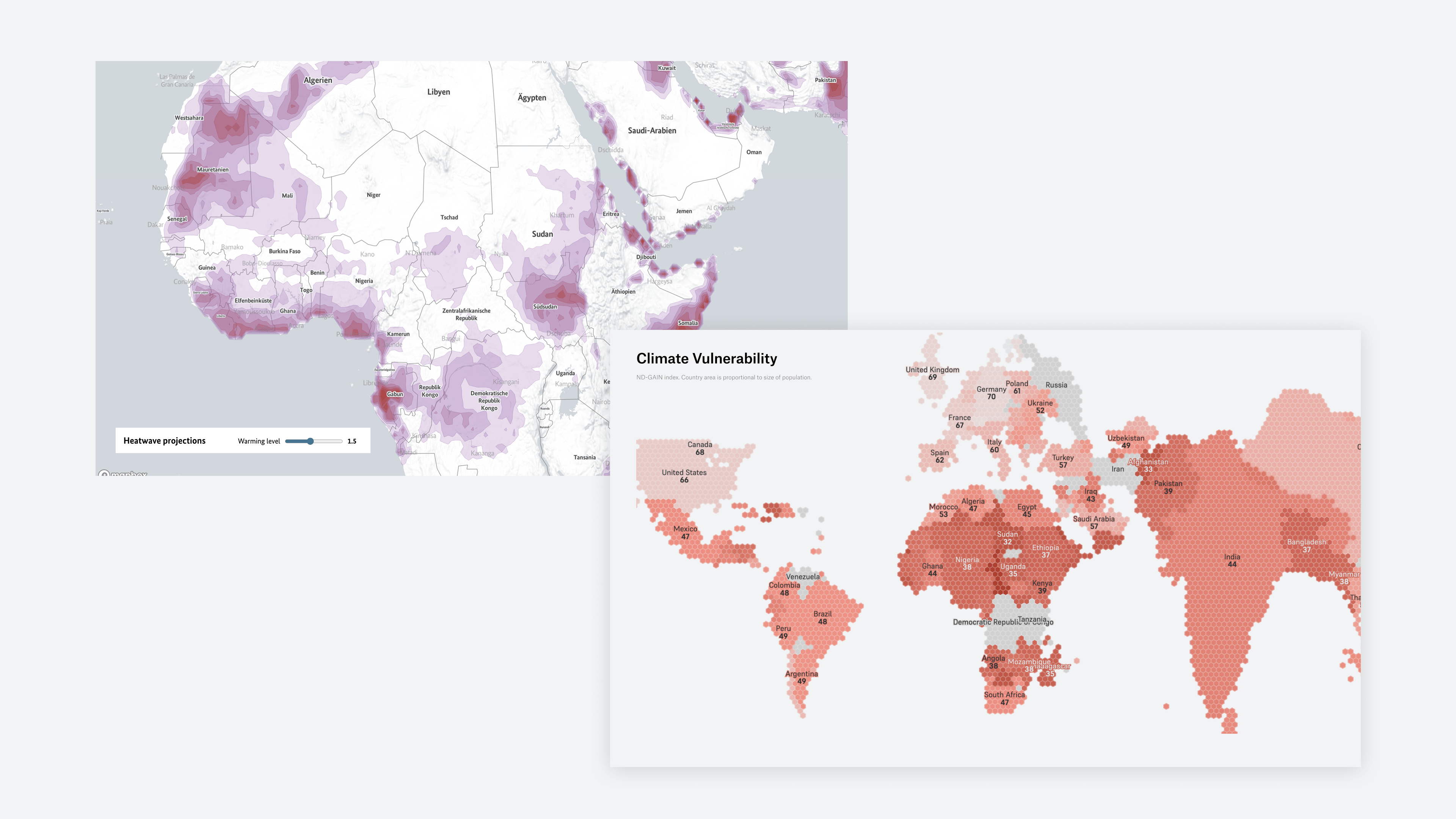
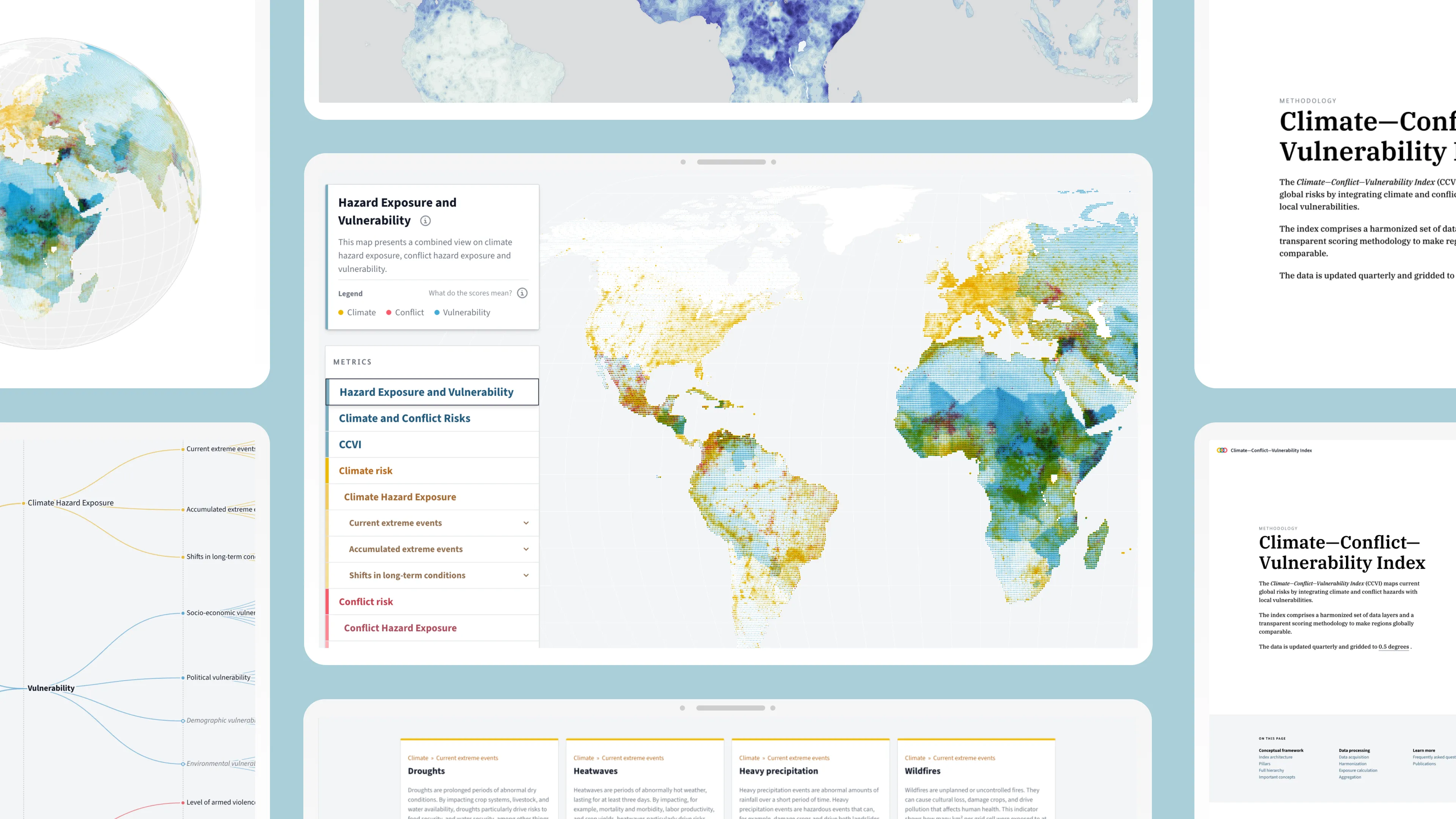
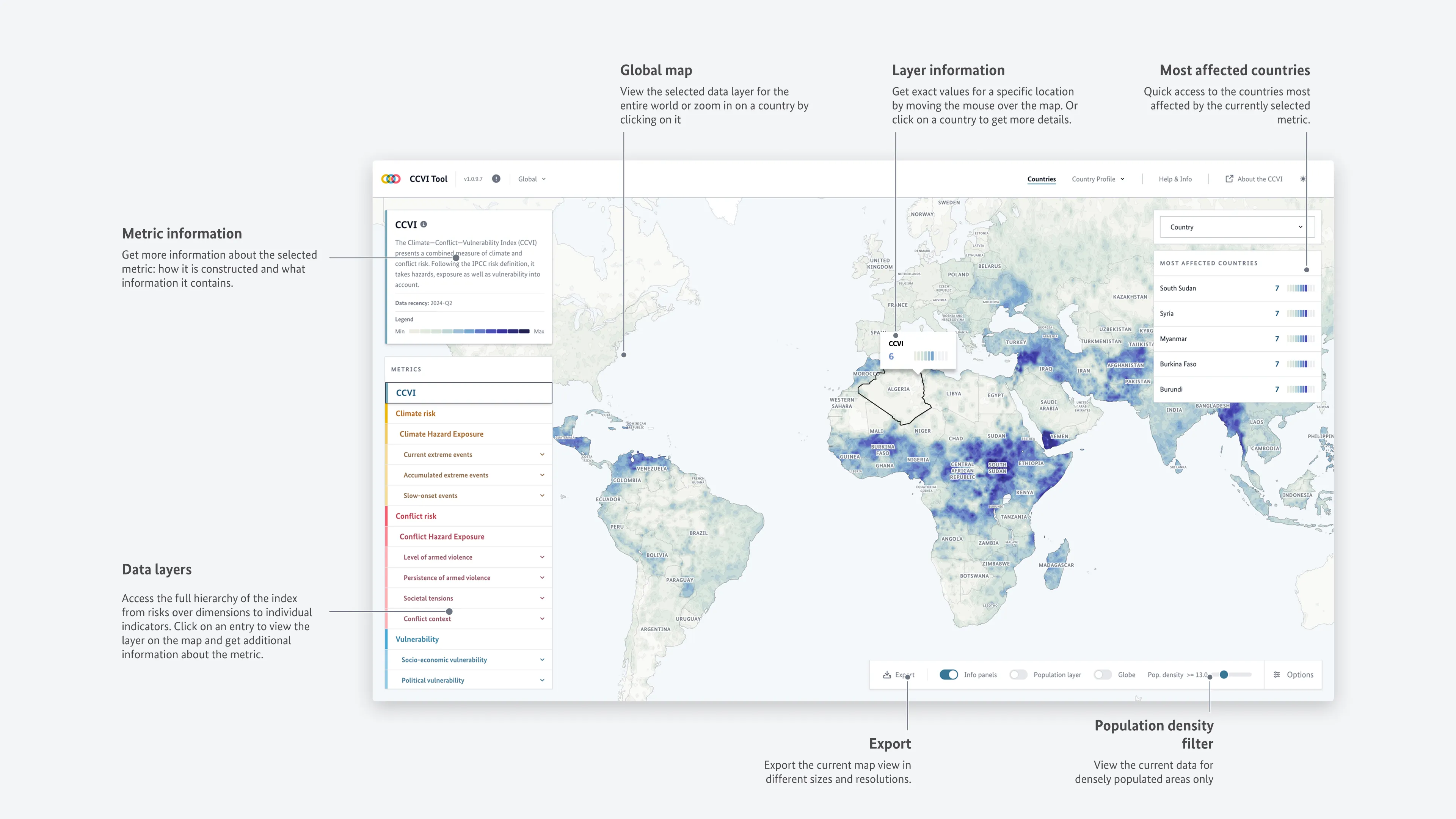
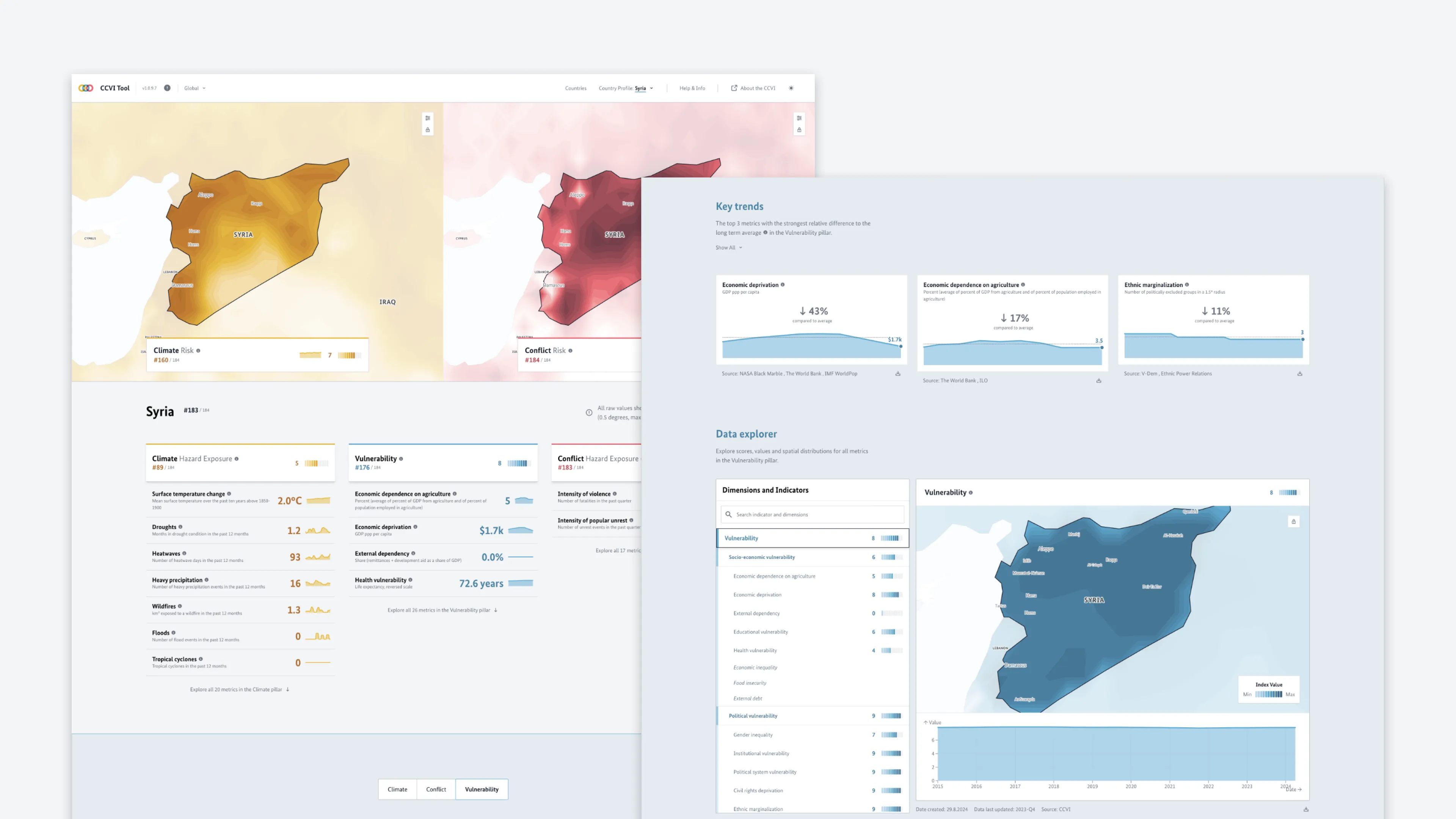
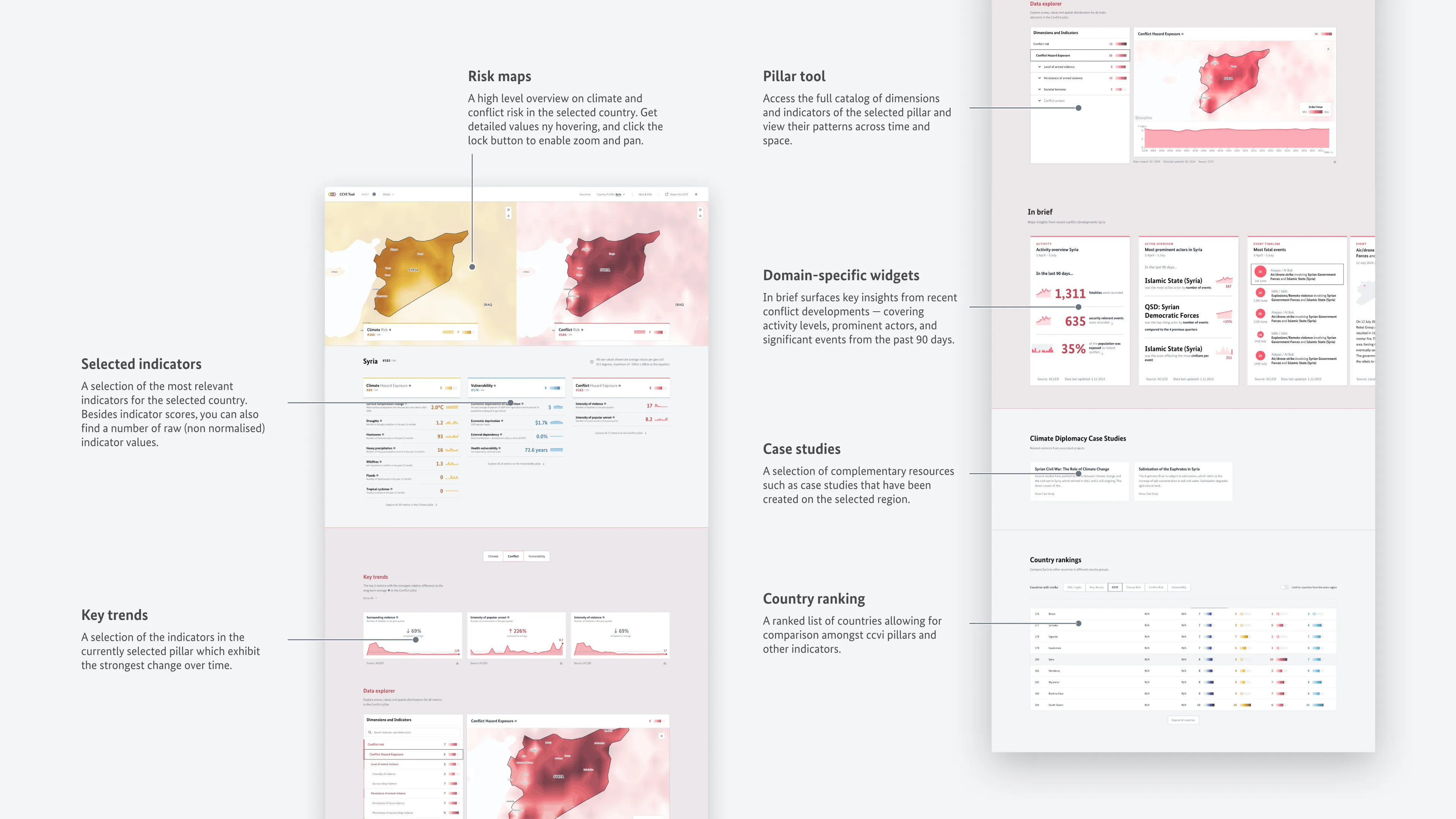
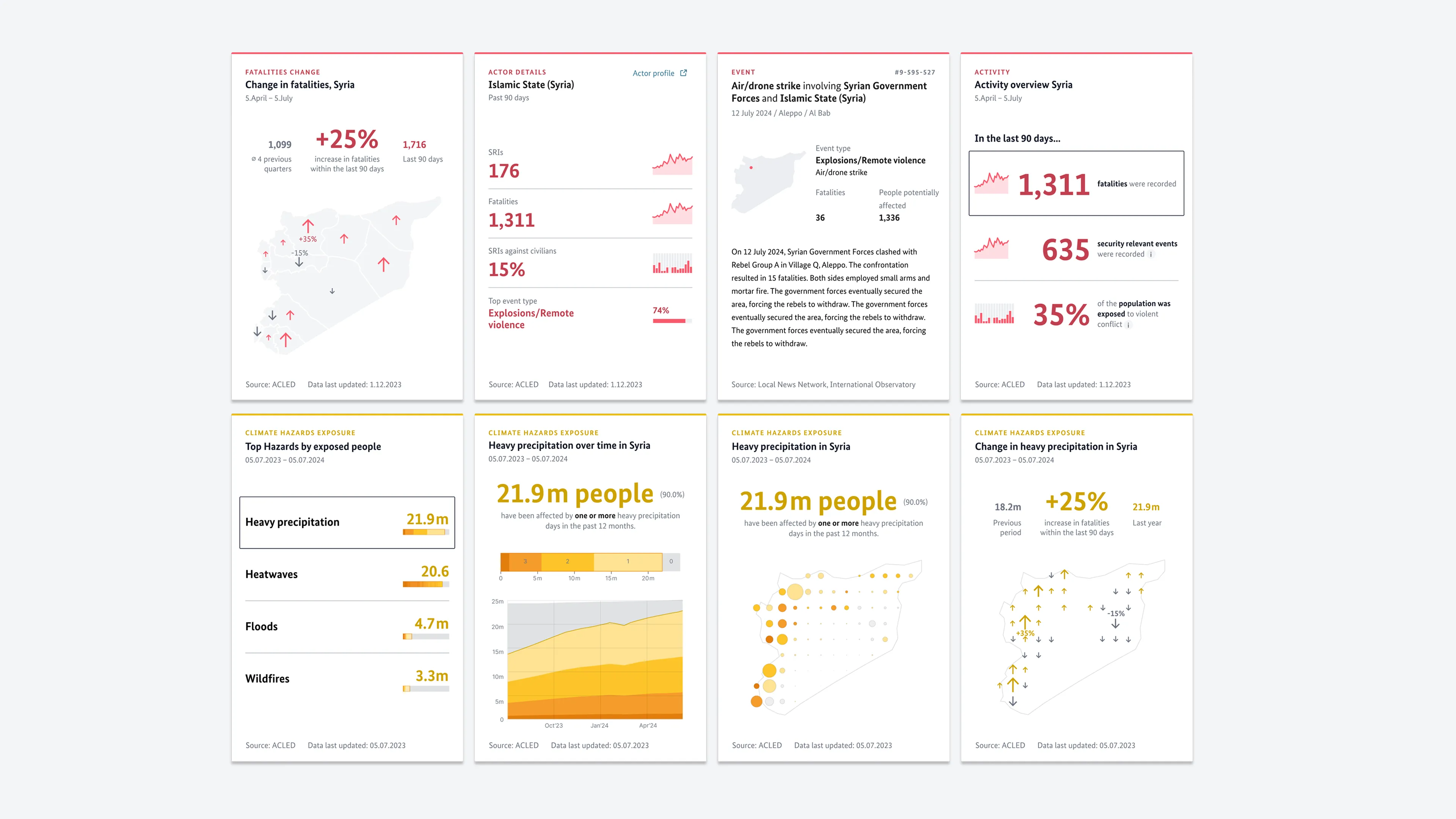
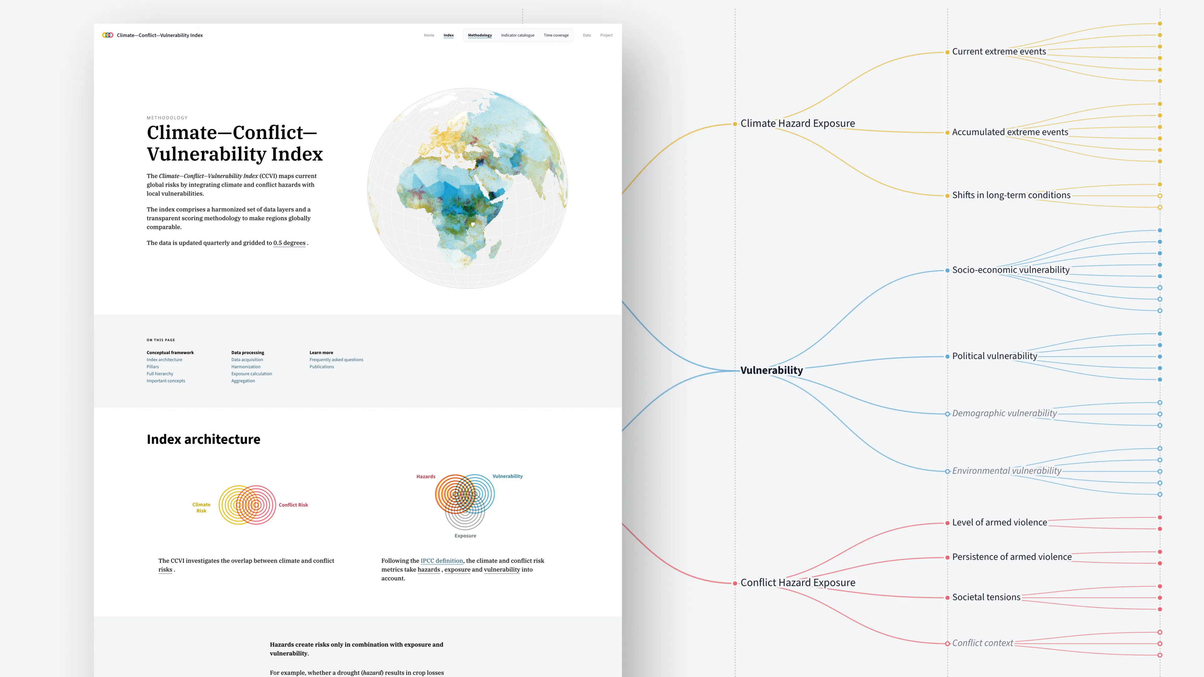
    Moritz developed the concept of Data Lenses: focused, self-contained chart or map views that each carry a single clear insight, annotation, or data perspective. Some would be static, others locally interactive — allowing selection of indicators or countries. Crucially, they were designed as reusable templates that could be recombined into larger stories or embedded as inline graphics in longer text. The concept opened up a way to make the index's complexity navigable without overwhelming the reader.

  • Design of the Data Lenses

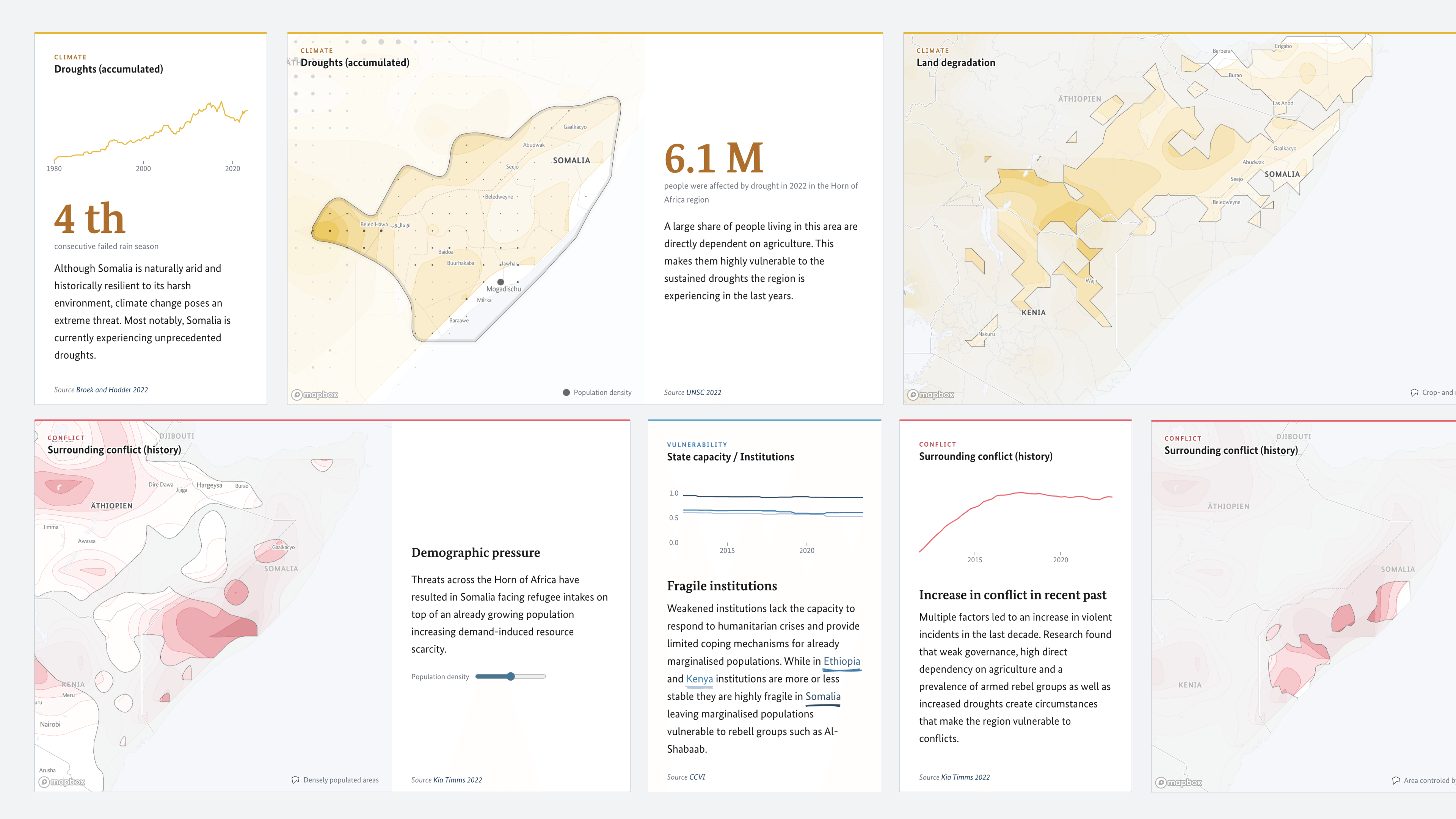
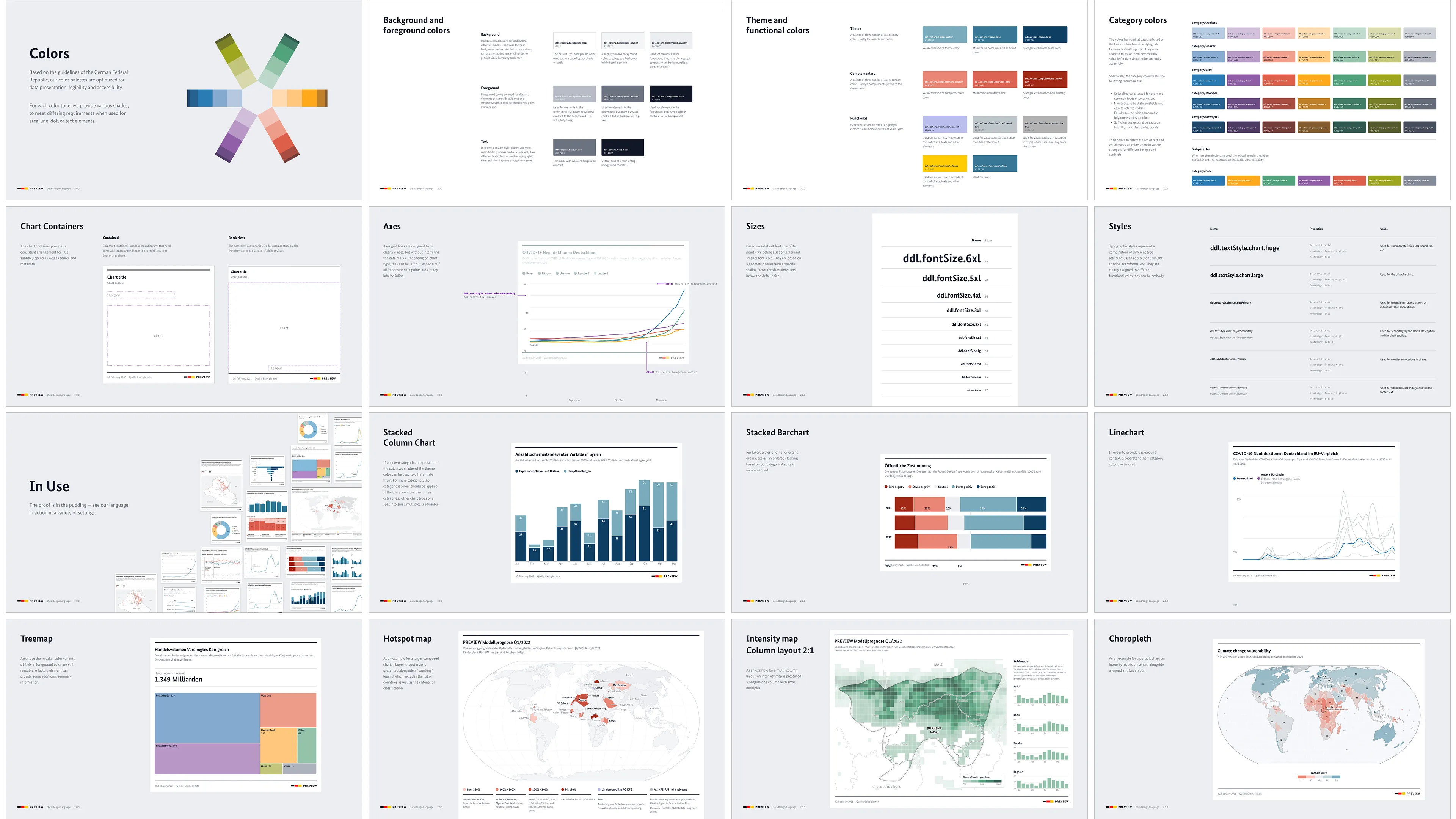
    Flavio took Moritz's concept into Figma and developed a set of highly visual, impactful lens designs spanning all three pillars — climate, conflict, and vulnerability. The designs worked across different chart types and data narratives, and gave us a strong visual direction: each lens would stand on its own, but feel coherent as part of a larger system.

  • Development: Conflict Widgets

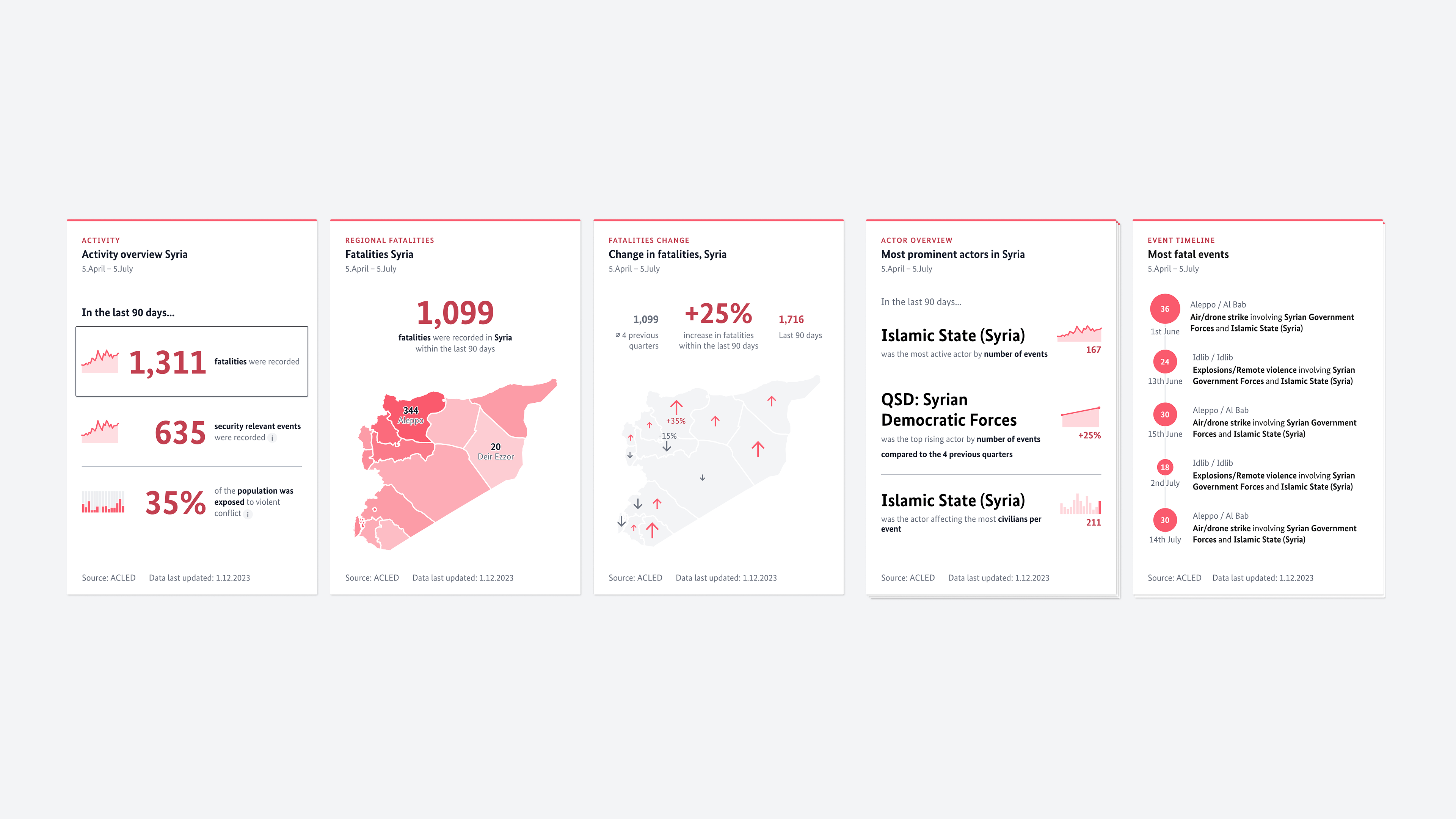
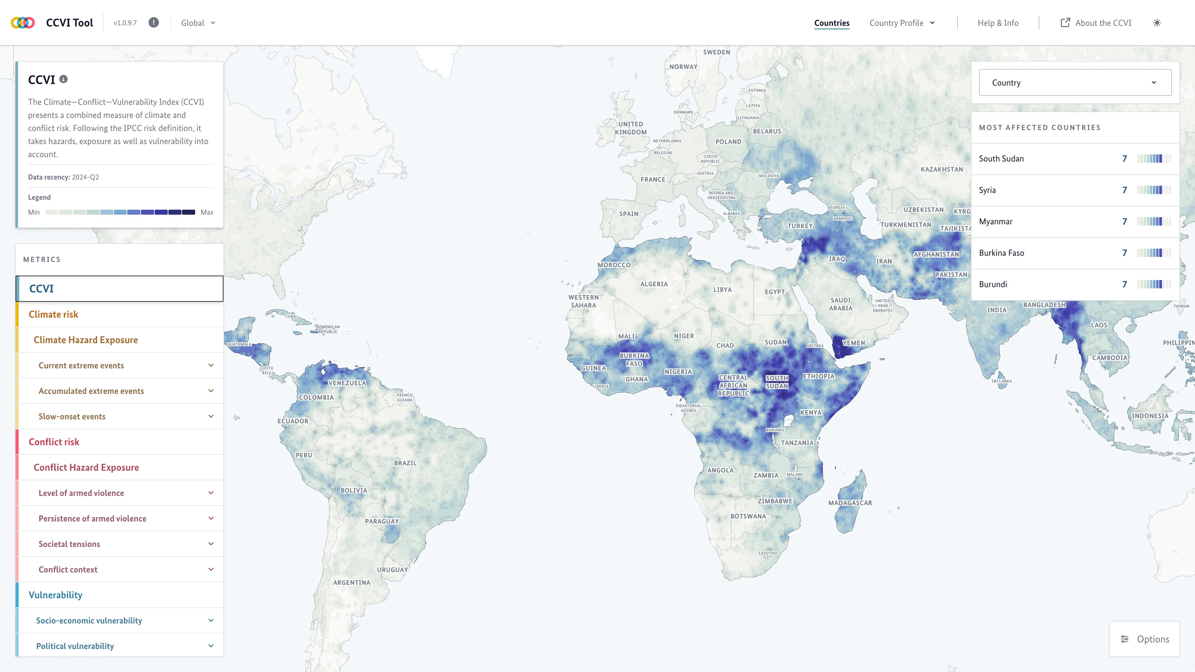
    I took Moritz's concept and Flavio's designs and developed the lenses into an integrated widget system for the internal tool — with widget groups clustering related subjects within each pillar. For conflict, for example, that meant separate groups for activities, actors, and events. Within each group, widgets could be stacked and drilled into by selecting an item from the top-level card. The resulting system was flexible enough to be used outside the internal tool as well, and played a key role in simplifying the country view — replacing what had been an overwhelming detail screen with a structured, navigable set of focused insights.

    Impact

    Launched by a foreign minister. Used by the people who need it most.

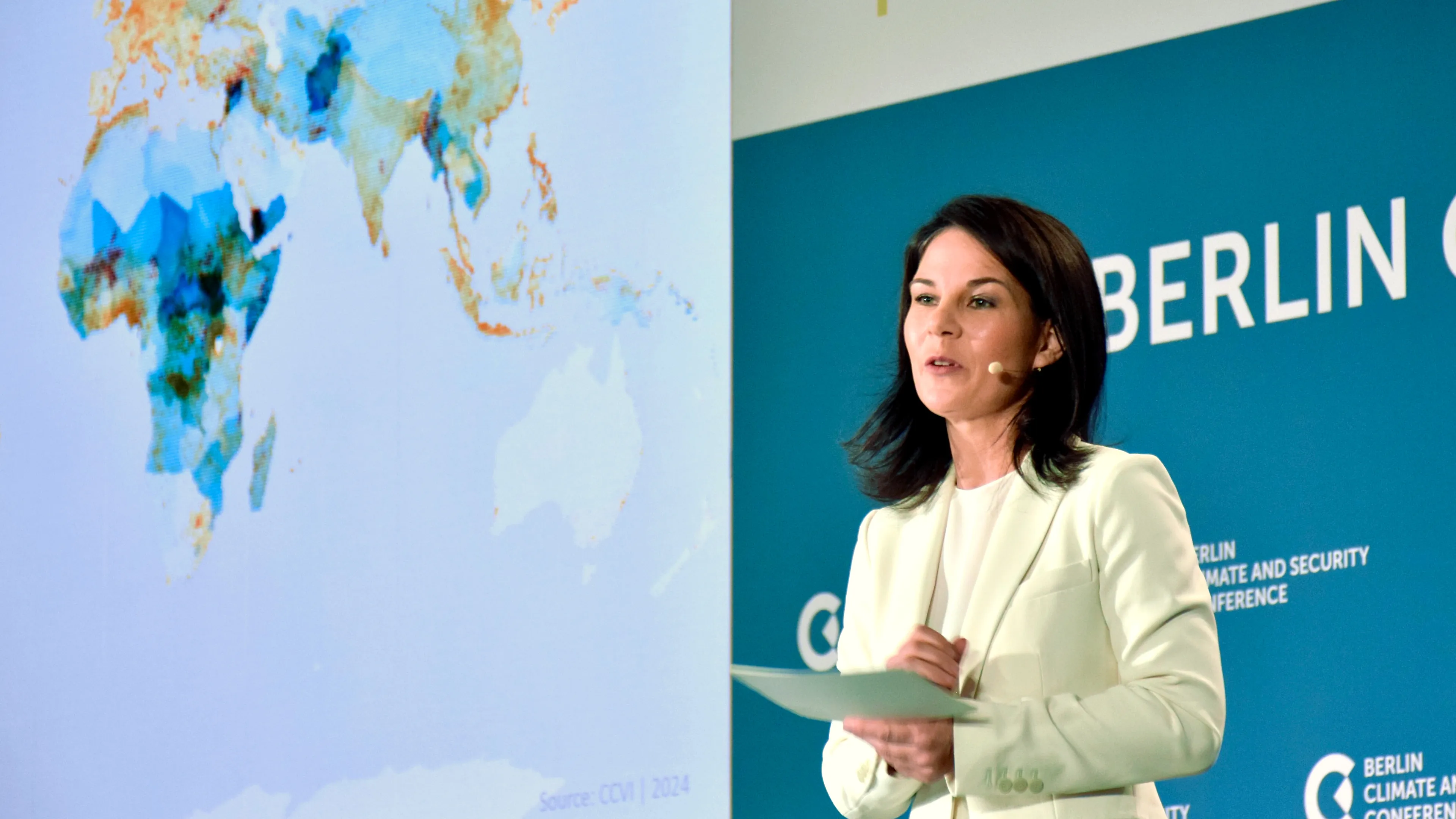
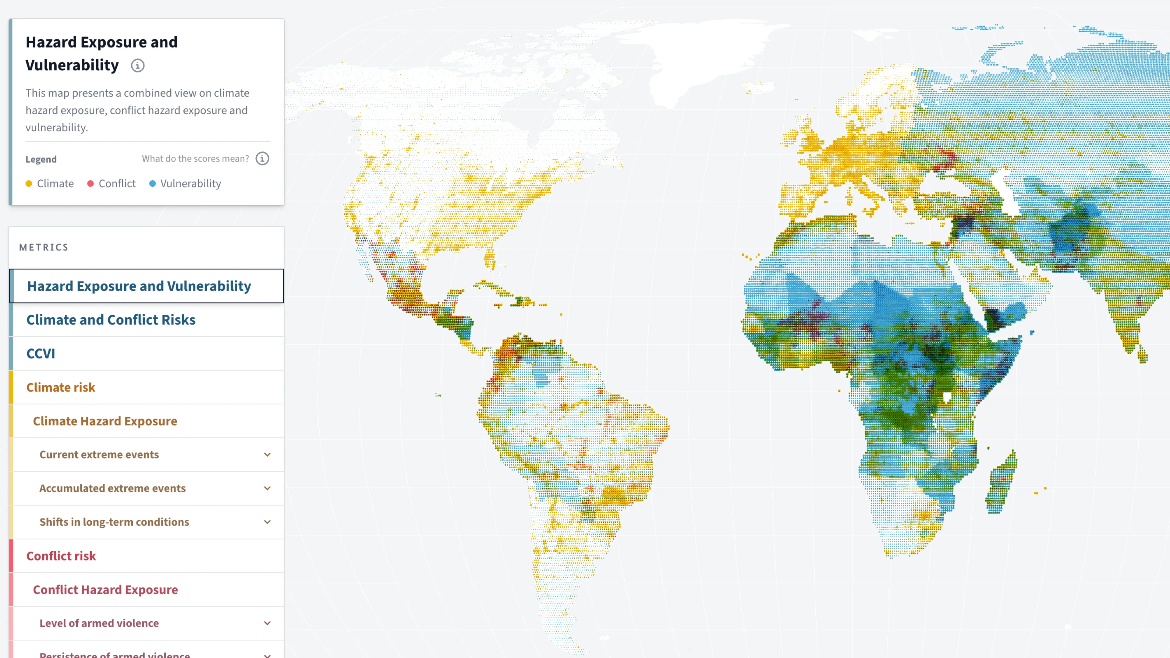
    The CCVI was publicly launched by Federal Foreign Minister Annalena Baerbock at the Berlin Climate Security Conference 2024 — who called it the best early warning system for our own security. The accompanying research paper (SocArXiv, 2026) confirmed a key finding the index was designed to reveal: high conflict risk almost never occurs where climate risk is low — but high climate risk spans the full spectrum of conflict risk. The index also demonstrates why aggregate scores alone are insufficient: two grid cells with nearly identical combined risk scores can have entirely opposite drivers, requiring different policy responses. Evaluation workshops were conducted with experts in Kenya, Somalia, and Ethiopia, confirming the index aligns with local realities on the ground. The open-source data and pipeline were released in 2025, with historical coverage back to 2015. The project was shortlisted at the Information is Beautiful Awards and featured at re:publica. For the first time, the German Foreign Office and its partners have a single, quarterly-updated tool that makes the overlap between climate and conflict risk globally visible and navigable — replacing a fragmented, on-demand workflow with an ongoing evidence base for foreign policy decision-making.

    The index in numbers

    42
    Indicators across 3 pillars
    Global
    Global coverage at 0.5° grid resolution
    2015
    Historical coverage

    Learnings

    Build capability, not just deliverables

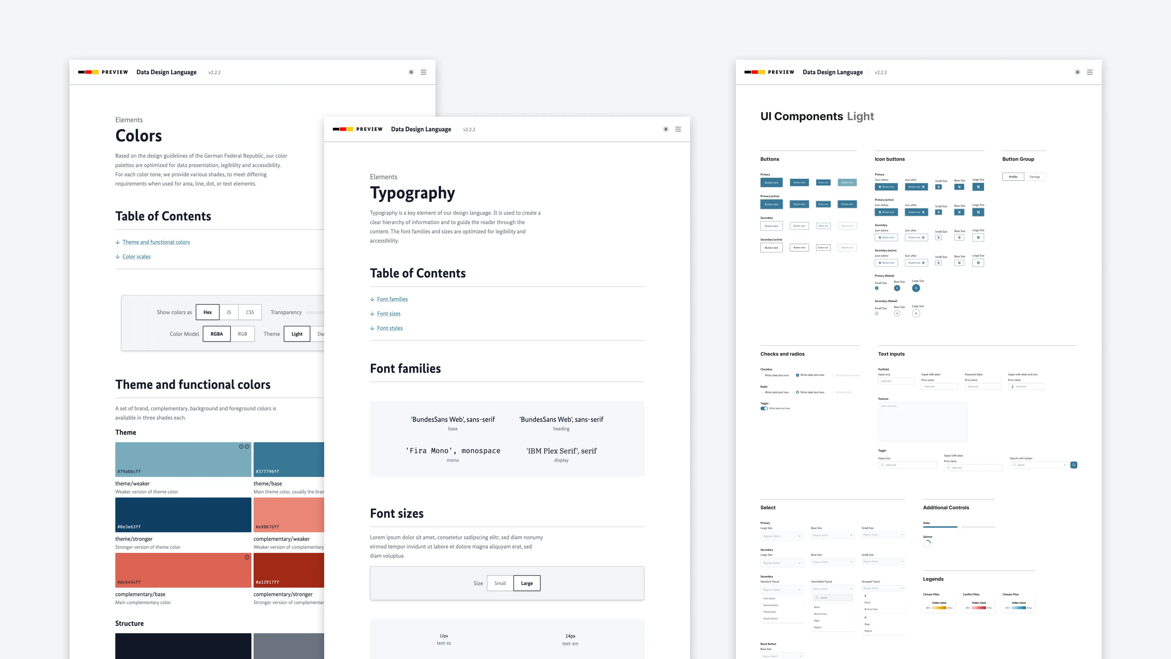
    The most lasting thing we built wasn't the tool — it was the Data Design Language and the Observable notebooks that let the PREVIEW team take ownership of their own data communication. Looking back, a closer working relationship between the design team and the researchers would have been valuable — not because collaboration was missing, but because the two teams operated at different speeds and with different methods. More overlap earlier might have opened up questions about indicator relationships and index structure that would have been useful to explore together. This project also sharpened a conviction that runs through my current work: making a 42-indicator, three-pillar index legible to non-technical audiences is exactly the kind of explainability challenge that AI systems now face. The design methods transfer directly.

    Portrait of Christian Laesser

    Contact

    Do you need support for your next project?

    Time zone

    CET

    Current time

    Reply time

    2work days

    Your next project starts with a conversation. Not sure if your project is a good fit? Read the FAQ first — it might answer your question before we even talk.