World Bank Group

Atlas of Global Development 2026

Two stories built from scratch, eleven more reviewed and improved — part of a team effort to give the World Bank's flagship development publication a single, coherent visual language.

Atlas of Global Development 2026

Challenge

The Atlas of Global Development is produced by economists and researchers at the World Bank — not a single visualization team. Each of the twelve stories in the 2026 edition was authored independently, by people whose primary expertise is development economics, not data visualization. The design challenge was twofold: establish a visual language for the publication alongside art director Alice Thudt, then work author by author to apply it — reviewing charts and making sure twelve independently produced stories read as one coherent Atlas.

Solution

I designed and developed the full visualization stack for two stories — Skills Are Used and Built on the Job and Building Productive Cities for an Urbanizing World — from concept through production code in SvelteKit and D3. Both stories combine static, interactive, and scrollytelling chart types: multi-line time series, paired bar charts, dual-line area charts with gap fill, waffle charts, and beeswarm charts. In parallel, I worked with Alice Thudt on the site layout and start page, contributed front-end components including navigation, and reviewed and improved charts across all other authors' stories. The social media assets for the Atlas launch were part of the same scope.

My Contribution

I led visualization design and development for two stories — working closely with author Divyanshi Wadhwa on the urbanization story and with Brian Stacy on the education story. The back-and-forth with both authors shaped the work significantly, improving both the arguments and the designs. Across the cross-Atlas review, I worked with Alice Thudt and Maarten Lambrechts to identify charts that needed improvement and reworked them — making sure each chart met the visual language of the Atlas and told its story as clearly as possible.
  • Client

    World Bank Group

  • My Role
    Data Visualization Design
    Data Visualization Development
    Visual Design
    Web Development
  • Time

    2025–2026

  • Collaboration

    Alice Thudt (art direction, design), Maarten Lambrechts (visualization, editing), Jan Willem Tulp (visualization), Ændra Rininsland (visualization), Dominikus Baur (platform development)

Results
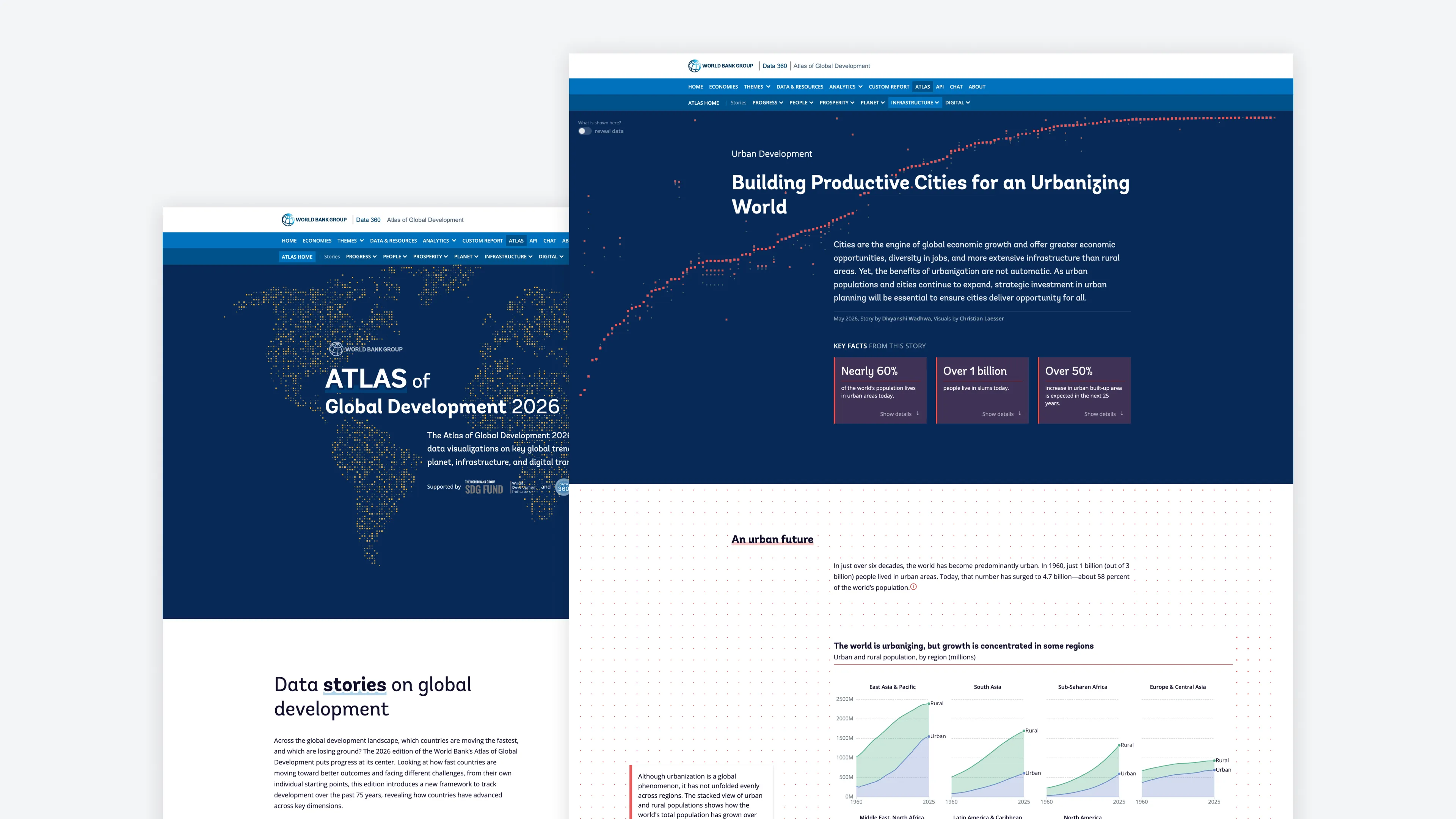
Atlas website and story entry page
The published Atlas platform and the entry page for "Building Productive Cities for an Urbanizing World". The article page opens with title, subline, and key-fact callouts — giving readers an immediate overview and first takeaways before they scroll into the story. The navigation header was integrated to sit within the broader Data360 platform.
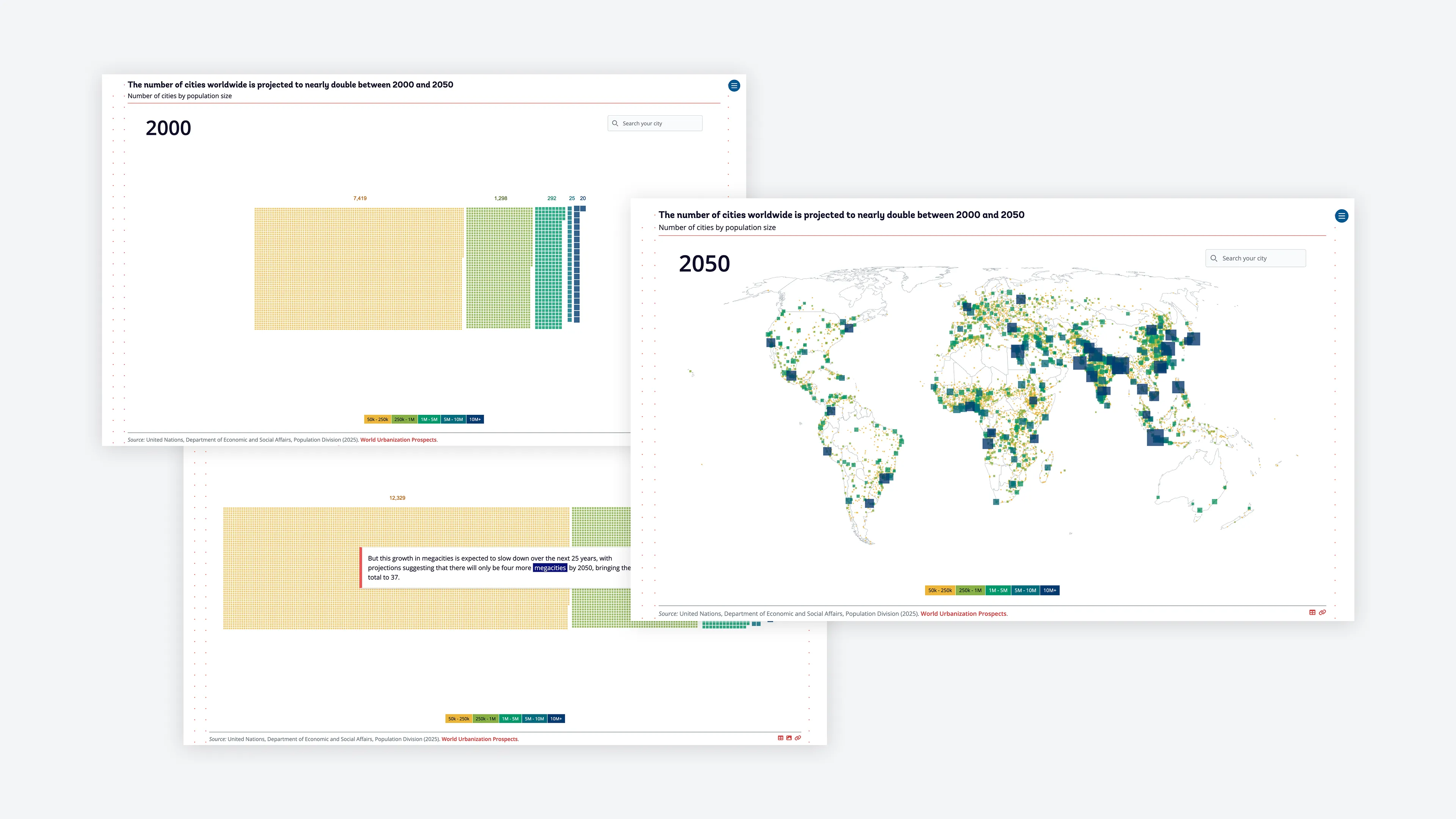
Cities by population size — waffle chart and map view
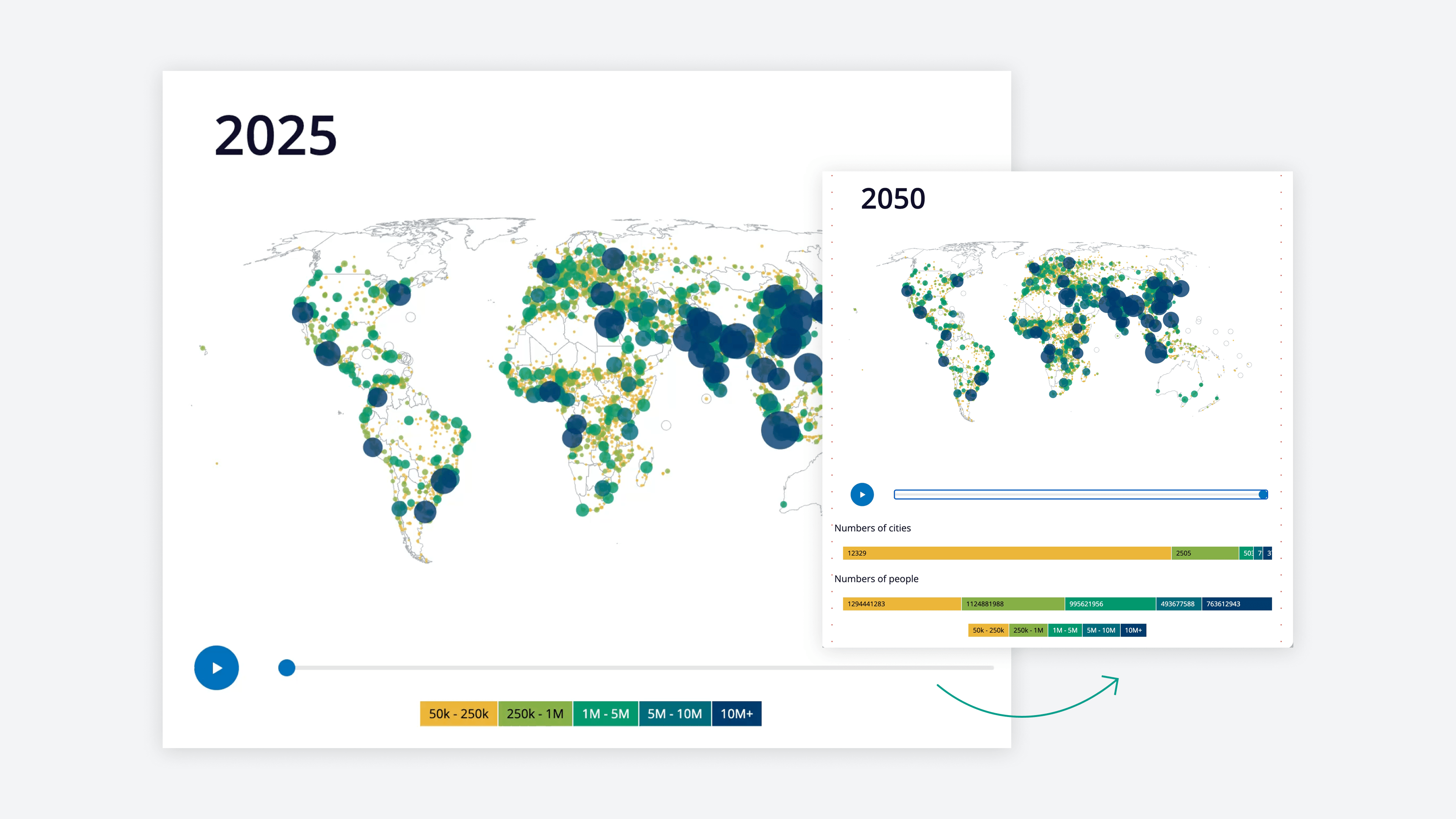
A scrollytelling waffle chart and its map view showing the number of cities worldwide by population size category. The waffle chart helps readers understand how each city size category grows over time — each square is one city, making the proportions between categories directly comparable. The map view positions the same data geographically, anchoring the numbers in place.
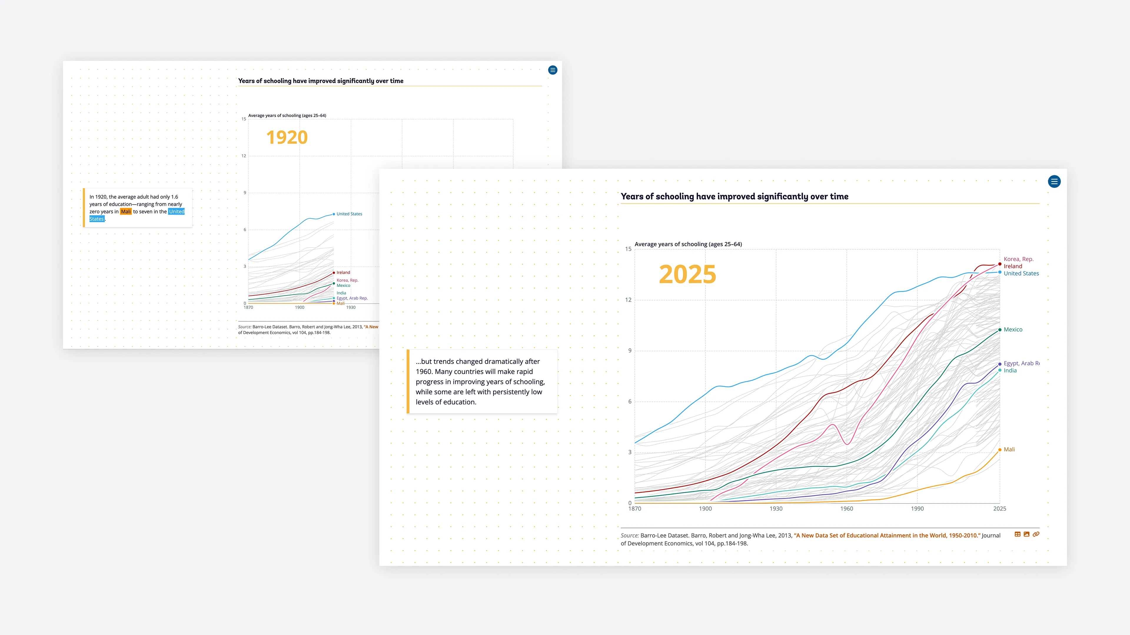
Years of schooling across countries and regions
A multi-line chart tracing how years of schooling have changed across countries and regions over time. Countries are colour-coded, making it possible to follow individual trajectories and compare regional patterns — from those that expanded schooling rapidly to those that have remained persistently low.
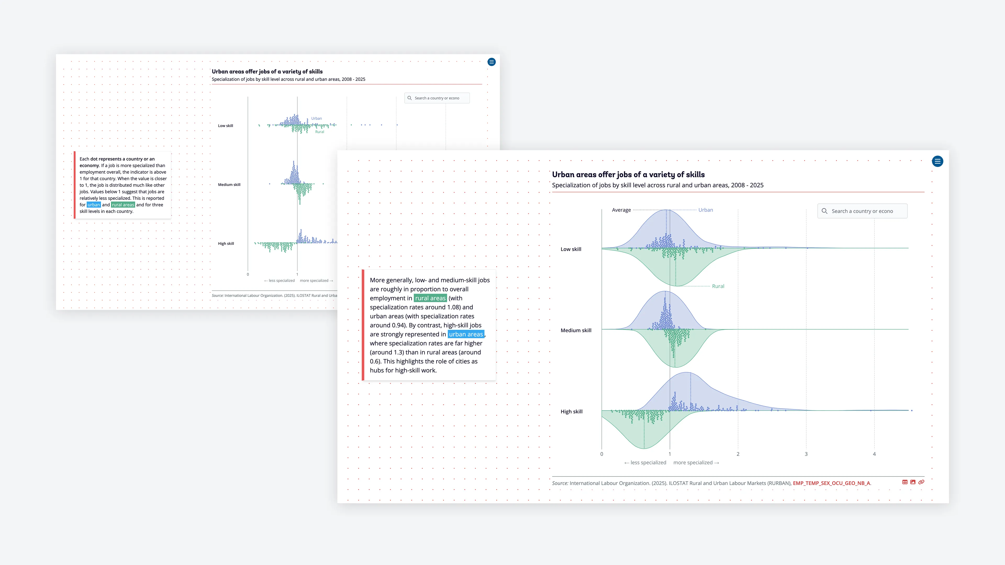
Job specialization by skill level — urban vs. rural
A scrollytelling dot strip plot showing job specialization by skill level across urban and rural areas. Each dot is a country. The transition from raw data points to a density distribution makes the pattern legible: high-skill jobs concentrate in cities at rates far above rural equivalents.
Learning-adjusted years of schooling
Paired horizontal bars comparing years of schooling with learning-adjusted years across country income groups. Low-income countries already have shorter schooling — but when adjusted for what is actually learned relative to other countries, those years shrink further still. In Mali's case, the adjustment reduces the effective schooling by 49.3%.
Wage gap by education level over a career
Dual-line area charts comparing wages across education levels over a career in two countries. The gap between those with a tertiary degree and those without primary education is striking in both cases — and it widens over time.
Job specialization by occupation type
Violin and strip chart showing job specialization across 10+ occupation categories — Agriculture, Industry, Services — comparing urban and rural areas. Apart from agriculture, forestry, and fishing, all other occupations are more specialized in urban areas, making the case for cities as engines of diverse, high-skill work.
Climate hazard exposure — chart rework
A chart reworked during the cross-Atlas visualization review. The original version was replaced with an approach that makes the regional comparison more legible and better serves the story's argument.
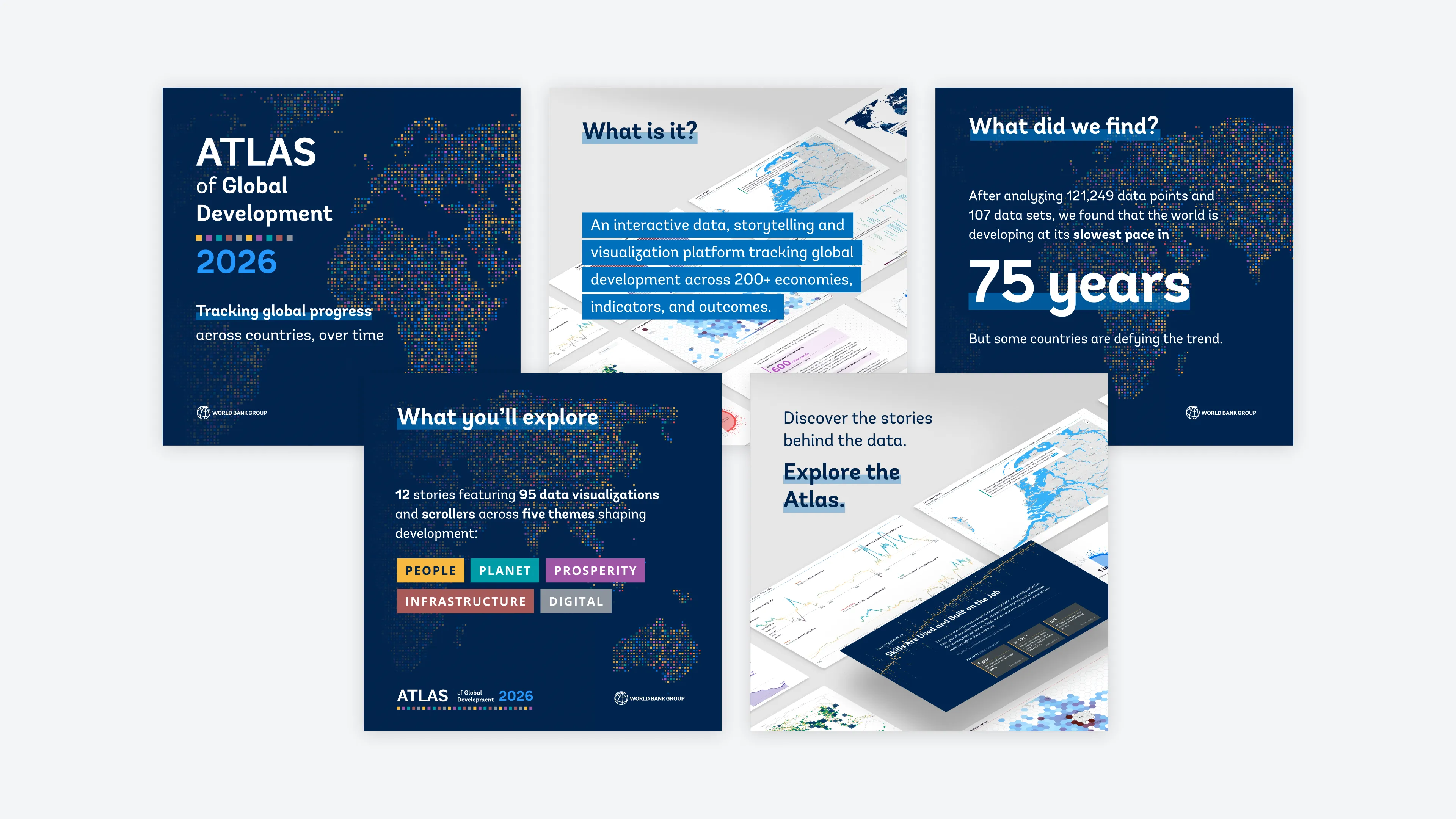
Social media assets
Social media assets
Five launch cards for the Atlas — title, platform description, headline finding (slowest development pace in 75 years), content overview (12 stories, 95 data visualizations across 5 themes), and a story showcase card. The cards extend the Atlas visual identity into formats the publication team could use directly for distribution.

Process

  • Map only — the starting point

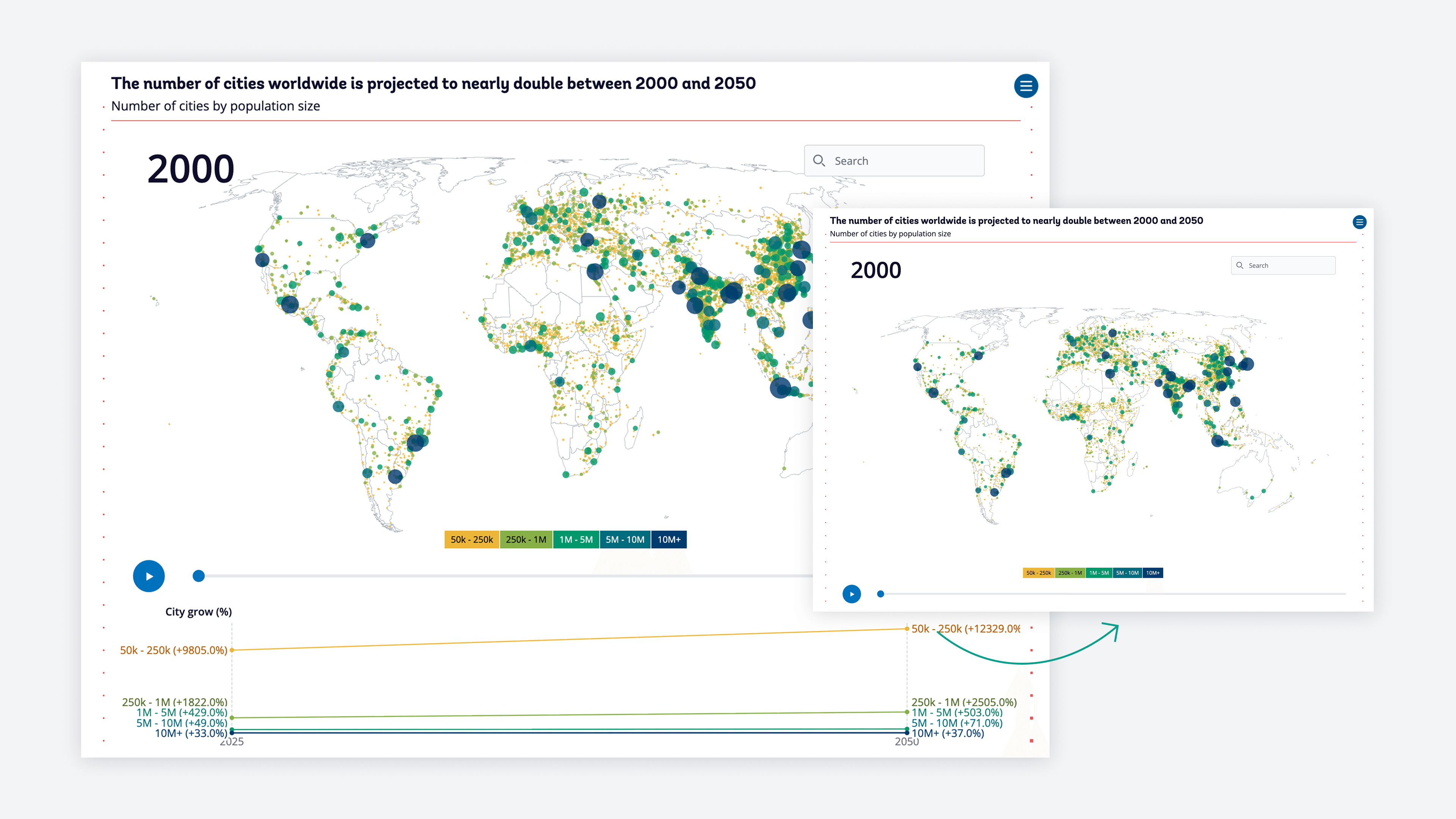
    The initial approach for the cities chart was a map-only view showing city sizes across three time steps. The problem: readers had to memorize the previous year's state to compare, and the size distribution across city categories was hard to read. The map alone wasn't enough to make the argument.

  • Map + line chart — a failed attempt

    Adding a line chart below the map to show city growth distribution over time created a new problem: the large cities appeared dominant because their growth lines were most visually prominent. The actual story — that the fastest-growing category is smaller cities, not megacities — wasn't coming through. The chart was technically accurate but argumentatively misleading.

  • Scrollytelling waffle + map — the solution

    Moving to a scrollytelling sequence gave the freedom to take readers through the story step by step. The waffle chart makes year-to-year comparison easy — each square is one city, size categories are directly comparable. The map view at the end anchors the numbers geographically. Two chart types, one argument: small cities are where urbanization is actually happening.

    Impact

    One visual language across twelve independent stories

    The 2026 Atlas established a consistent visual design language across twelve independently authored stories — each produced by World Bank economists and researchers working with their own data. The publication launched in May 2026 as the World Bank Group's primary annual data reference for policy makers and national governments worldwide.

    Atlas of Global Development 2026 in numbers

    95
    Data visualizations
    121K+
    Data points
    200+
    Economies tracked

    Learnings

    Domain partnership makes the work better

    Working closely with both Divyanshi Wadhwa and Brian Stacy on the two stories taught me something I want to carry into every project: the best visualization work happens when the domain expert and the visualization designer are genuine partners, not in a briefing relationship. They knew what the data needed to say. I knew how to make it legible. The ping-pong between those two things made the work better than either of us could have produced alone. Across the cross-Atlas review, the same principle held — showing up not as someone who makes charts look better, but as someone who asks whether the chart is making the right argument in the first place.

    Portrait of Christian Laesser

    Contact

    Do you need support for your next project?

    Time zone

    CET

    Current time

    Reply time

    2work days

    Your next project starts with a conversation. Not sure if your project is a good fit? Read the FAQ first — it might answer your question before we even talk.